Designing With Purpose, Not Just Polish.

As a kid, I was always doing something creative with my hands, making picture-books out of construction paper and felt maters, tying socks and elastic bands together to make stuffed animals, all sorts of things. I’ve always had a surplus of creative energy that’s I’ve honed and refined through my post-secondary studies and time working freelance. I’m Millie Cooper, a graphic designer driven by the power that emotional storytelling has. My passions lie in creating visuals that connect to audiences on a deeper level; I love exploring messy and complicated themes and problems, then solving them through design! Blending that creative energy with the fundamentals of design, my work goes beyond making things look nice. Graphic design should guide, communicate, and create impact, not distract from it!
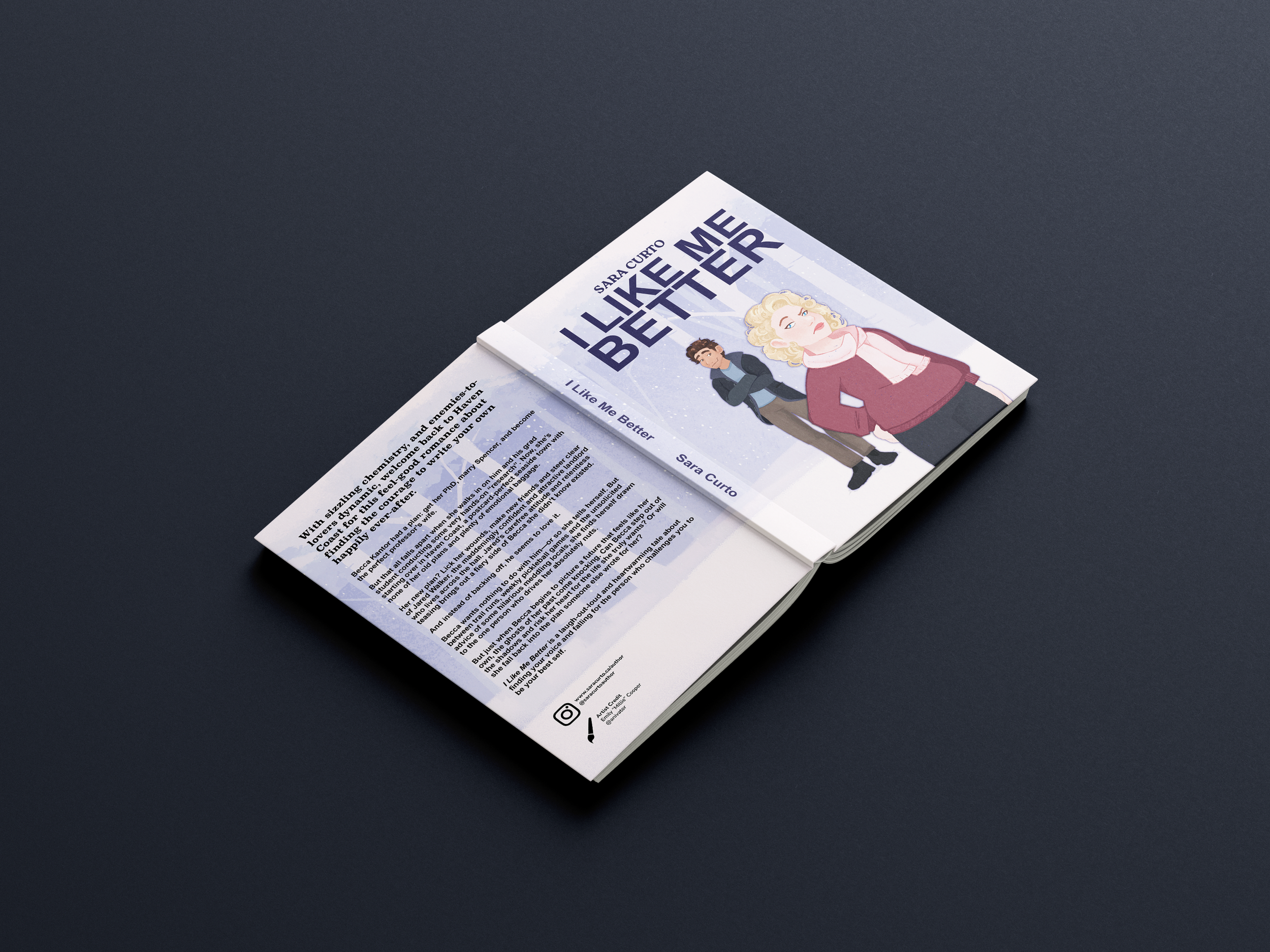
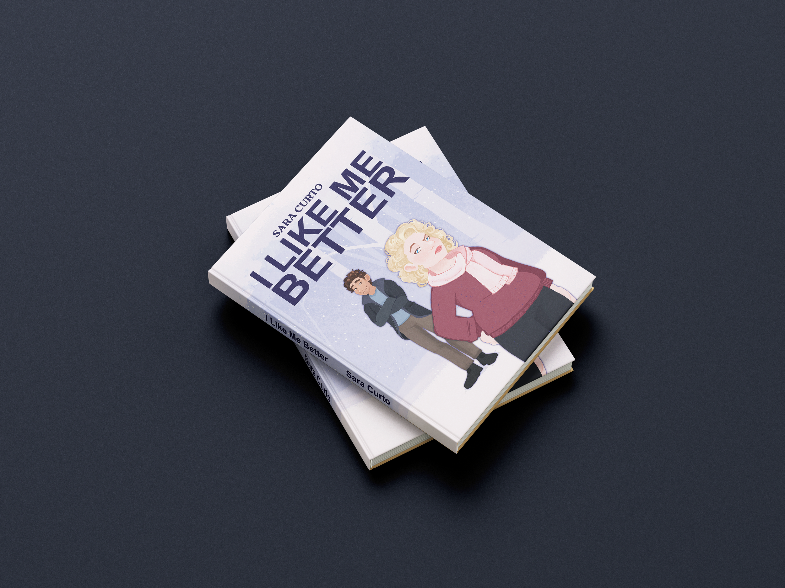
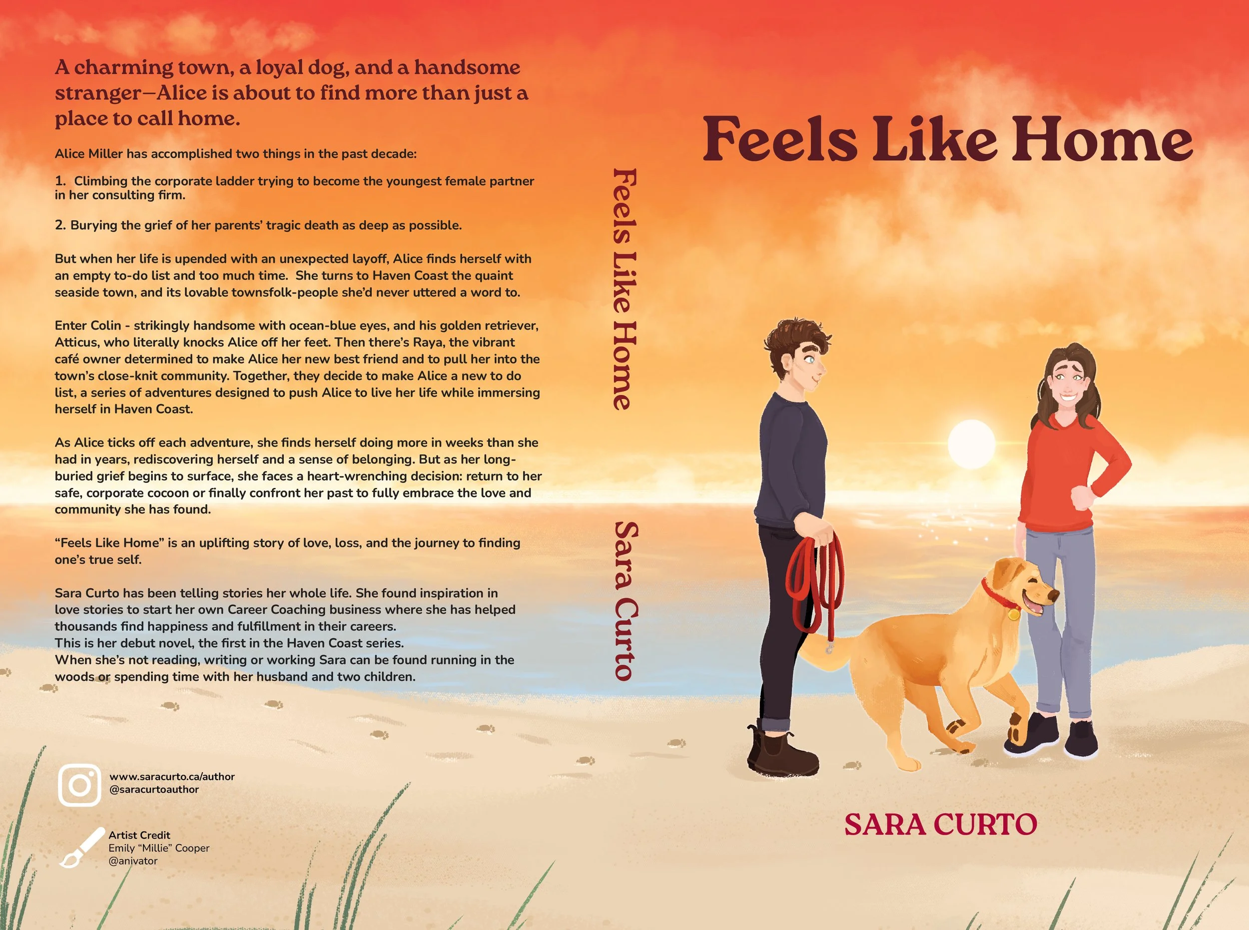
Sara Curto
Brand Guidelines
Brand Identity, Logo Design, & Social Media Design
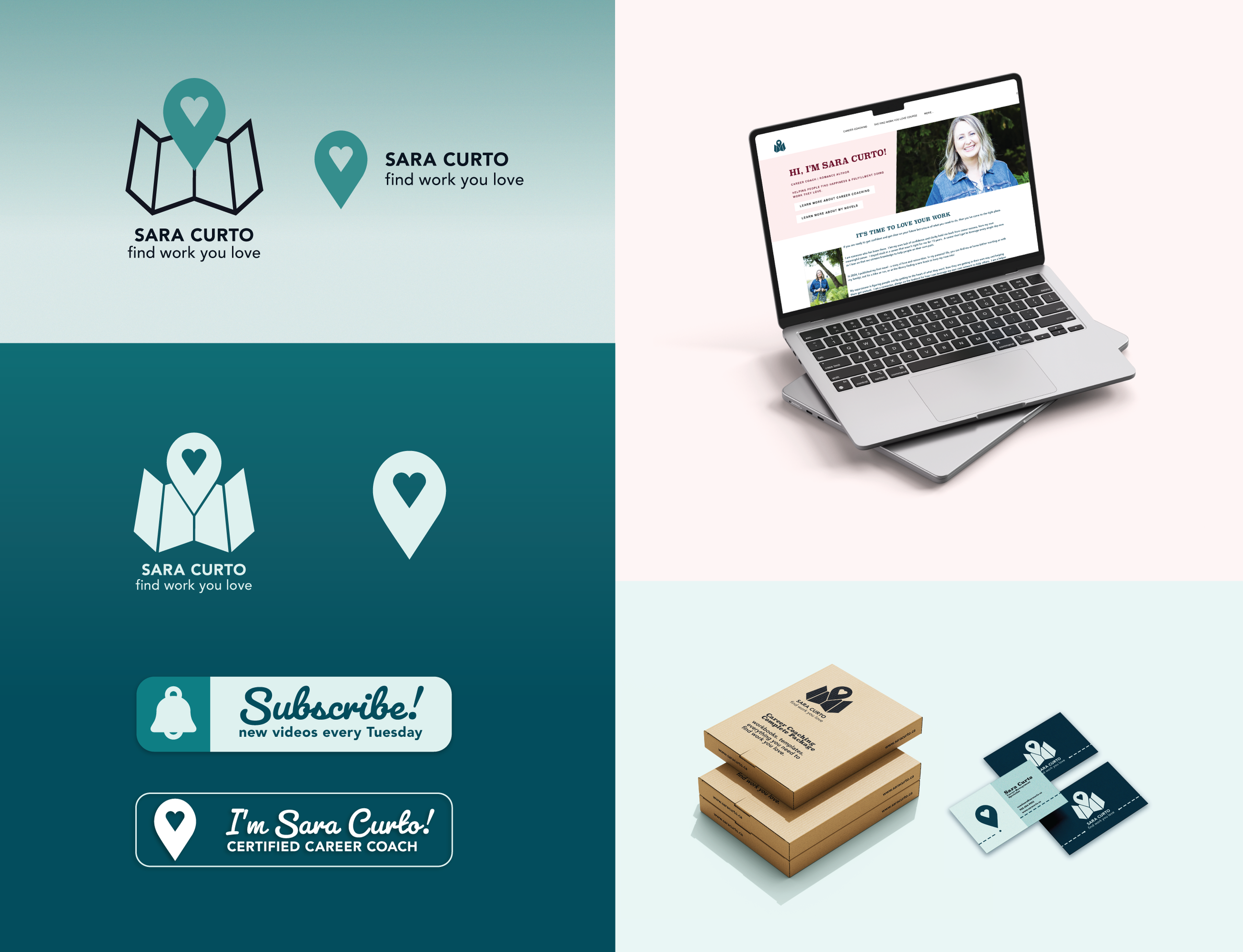
Problem
As Sara Curto Career Coaching expanded across social media, video, and client resources, the brand lacked a cohesive visual system. The existing logo was not scalable, the colour palette offered limited contrast, and typography choices were inconsistent, making it difficult to maintain recognition, professionalism, and visual unity.
Approach
I reviewed how the brand appeared across existing channels to identify gaps in consistency and clarity. The goal was to create a confident, supportive system that could be applied easily across future materials while transitioning smoothly from the brand’s established online presence.
Outcome
The final brand identity guide defines a refined logo system, stronger colour contrast, and a complementary type hierarchy. Together, these elements create a consistent visual foundation that strengthens recognition and supports long-term brand growth without losing its core personality.
Green Bean Café
Brand Identity & Website UI/UX Design
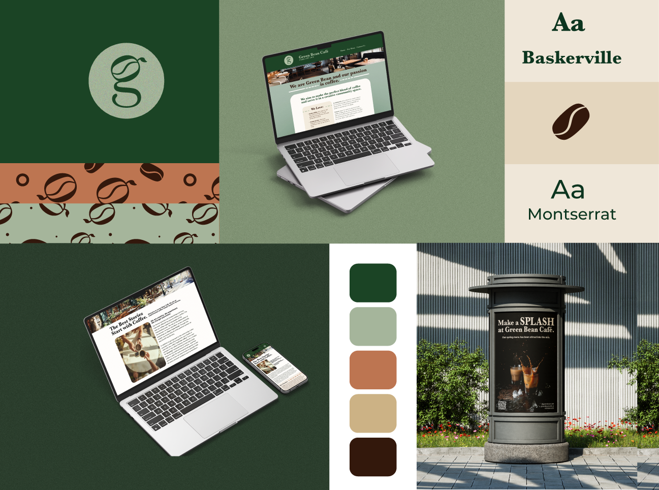
Problem
Green Bean Café lacked a cohesive visual foundation to support its growth. The existing logo was not standardized for consistent scaling, colour relationships lacked defined hierarchy and contrast, and typography usage was inconsistent across platforms. The website in particular did not reflect the café’s warmth, craft, or neighbourhood atmosphere. As a result, the brand’s personality was not clearly communicated, limiting recognition and differentiation within a competitive local market.
Approach
I developed a structured and scalable brand system designed to translate the café’s character into a consistent visual language. This included refining the logo with defined proportional rules and clear space standards, establishing a strategic colour hierarchy to improve contrast and accessibility, and selecting complementary typography pairings supported by spacing and layout guidelines. These principles were applied directly to a redesigned website experience to improve clarity, navigation flow, and overall cohesion.
Outcome
The result is a unified identity that aligns the digital presence with the in-store atmosphere, strengthening professionalism and long-term recognition. The improved website structure is projected to increase user engagement by 15–25%, while greater visual consistency across touch points may contribute to a 10–20% rise in local recognition and foot traffic. Defined brand guidelines also reduce production guesswork, potentially decreasing future content development time by 20–30%.
Sunroast Coffee
Brand Identity and Print Collateral
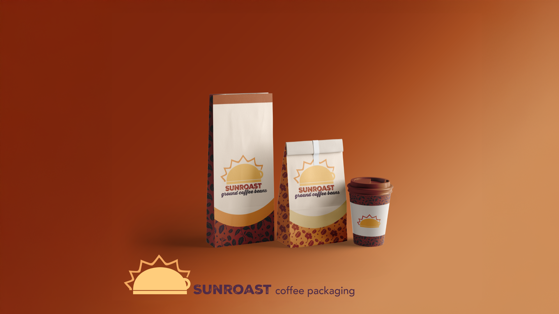
Problem
Sunroast Coffee needed a visual identity that felt warm, inviting, and rooted in sustainability, while still standing out in a saturated coffee market. The brand lacked a distinct system that could communicate its values clearly and remain consistent regardless of application.
Approach
I explored how symbolism, colour, and pattern can create emotional connection and recognition over time. Research into brand consistency and visual storytelling informed the development of a flexible system rather than a single logo mark, creating a recognizable brand system.
Outcome
I designed a cohesive brand identity centered on homey warmth and reliability. The logo transforms an everyday coffee cup into a sun symbol, supported by an earthy, high-contrast color palette and organic coffee-themed patterns. Together, these elements create a recognizable system built for consistency, scalability, and long-term brand trust.
Print Collateral
A selection of work that extends brand systems beyond the digital space and into physical, real-world applications. These pieces explore how illustration, typography, and composition can translate ideas and identity into tangible formats.


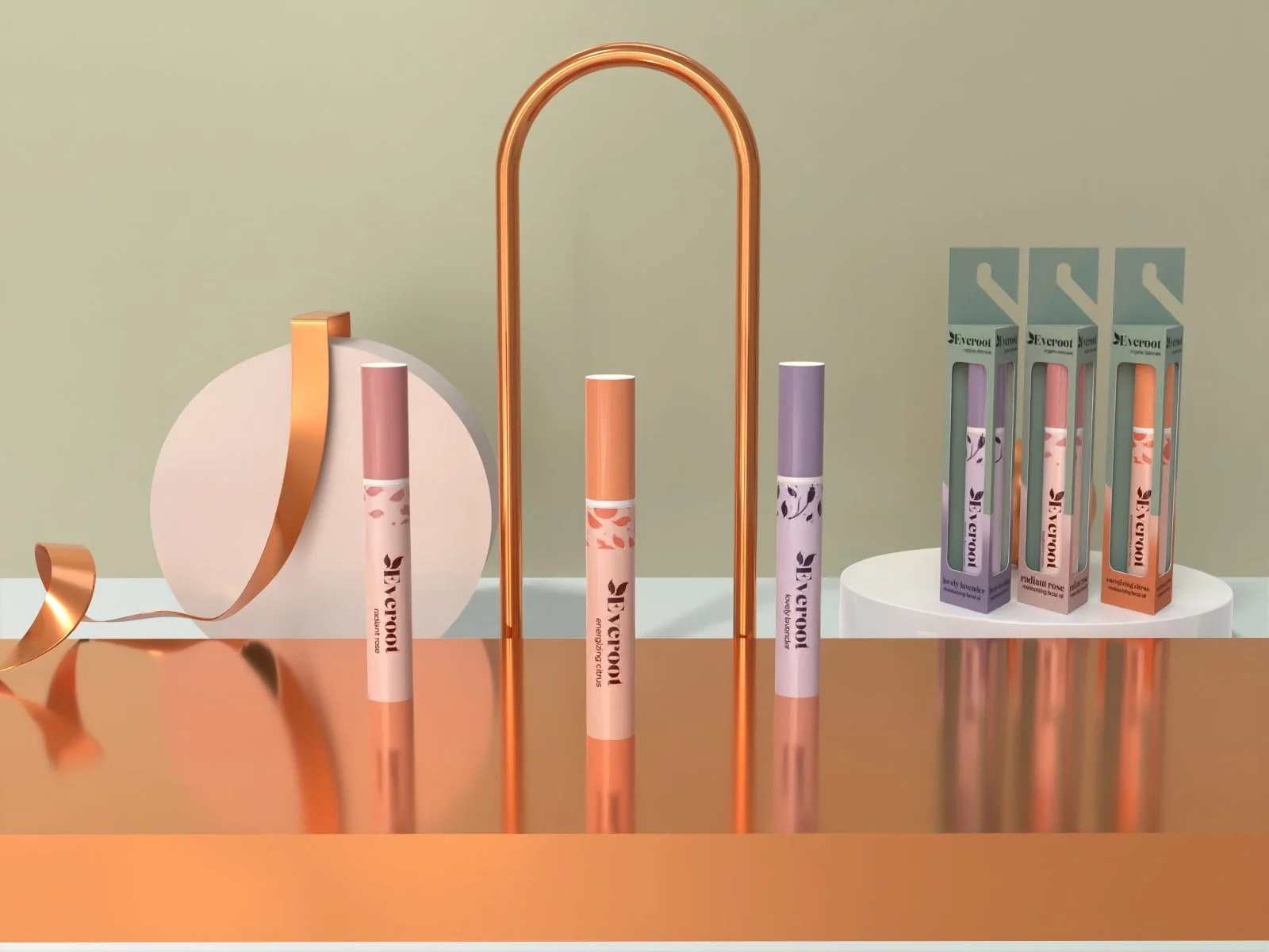
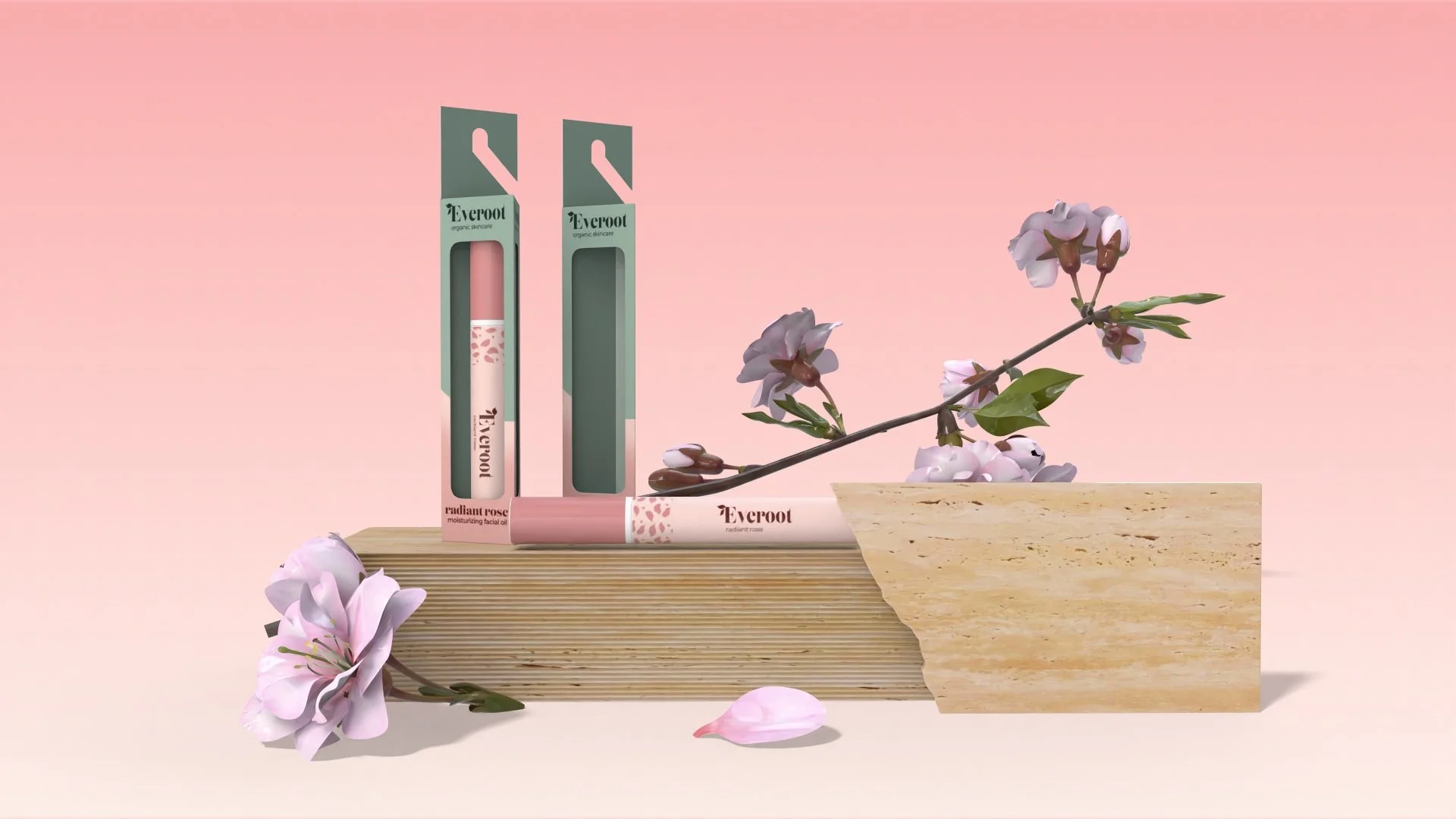
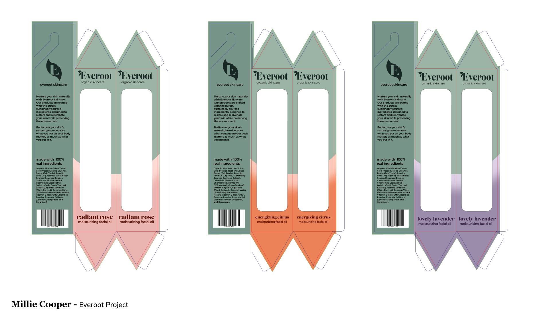
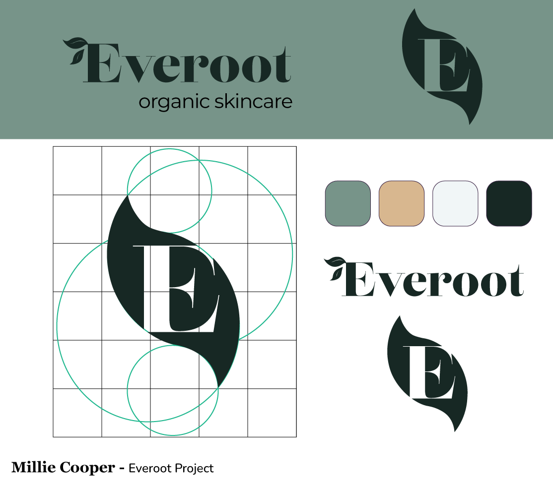
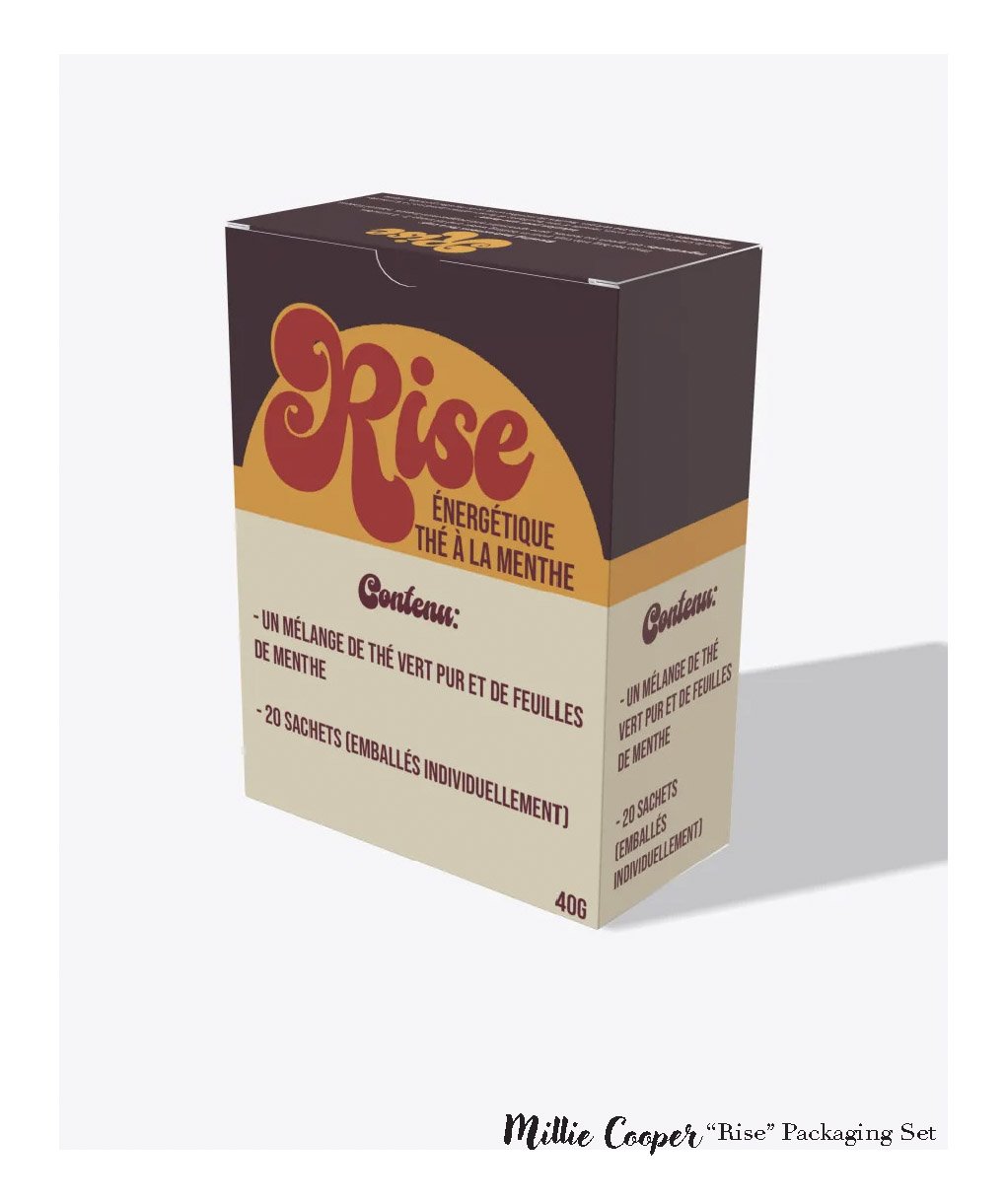
Package Design
Packaging projects focused on how products are recognized, understood, and experienced on the shelf. This work explores marketability, visual clarity, and brand presence, emphasizing how design supports both recognition and intent in physical retail environments.