

Green Bean Café
Role: Brand Identity & UI/UX Designer
Deliverables: Logo, Brand System, Packaging, Marketing Assets
Tools: Illustrator, Photoshop, InDesign
Project Overview
Green Bean Café is a conceptual branding and digital experience project focused on building a cohesive, scalable identity for a modern neighbourhood café. The goal was to create a system that feels warm, grounded, and approachable while maintaining clarity and usability across both digital and physical environments.
Rather than designing isolated visuals, the project centered on developing a structured brand system that could extend across website design, promotional materials, storefront signage, and future marketing campaigns. The result is a unified identity designed to perform consistently at every scale.
Problem
Green Bean Café lacked a defined visual foundation. The original identity did not include a properly constructed logo system, clear typography hierarchy, or consistent colour relationships. As a result, the brand’s personality was not being effectively communicated. While the café itself may have had warmth and character, that feeling was not reflected visually, which was weakening its presence locally and limiting its ability to stand out in a competitive market.
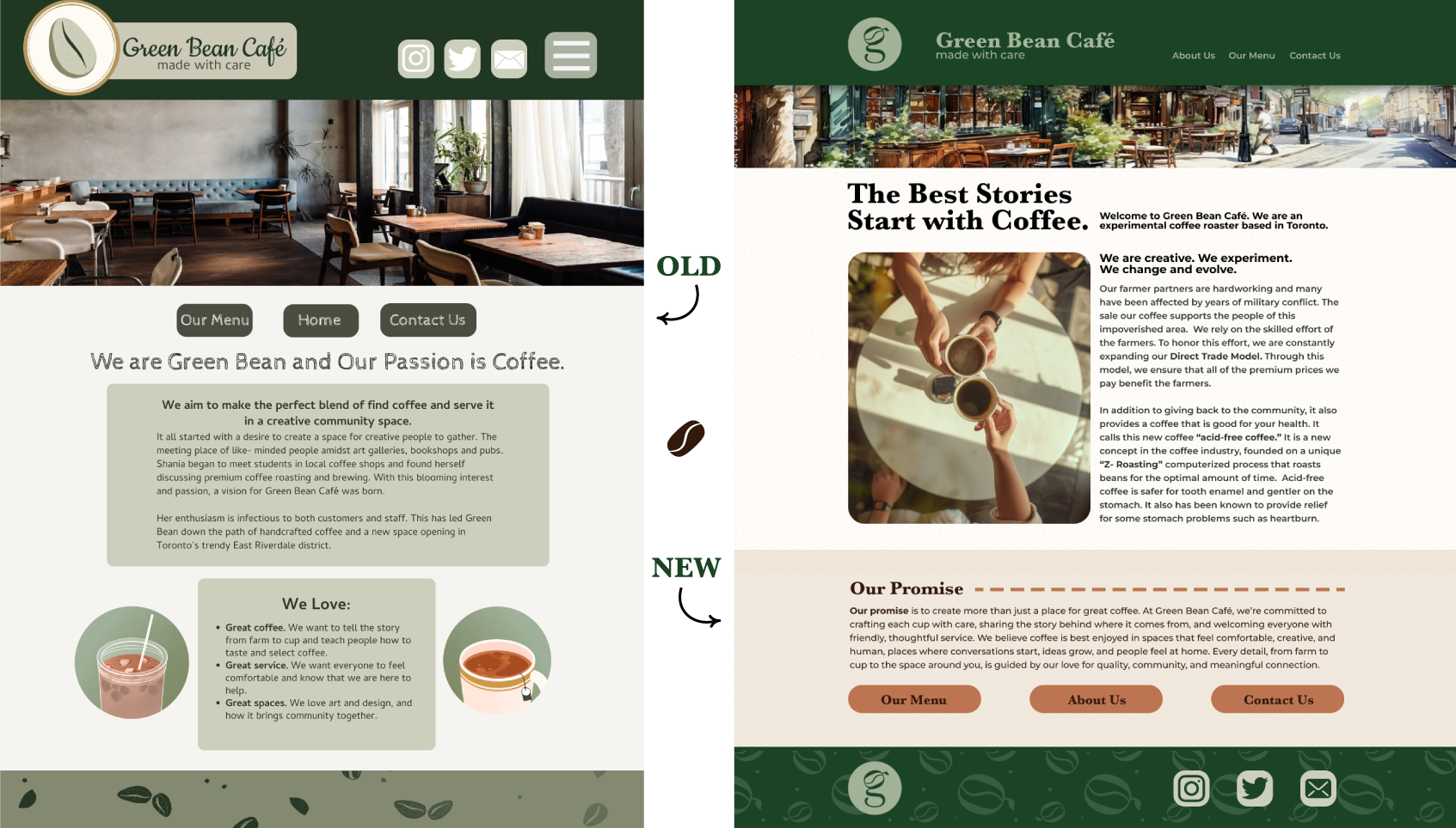
The website design in particular did not reflect the warmth, craft, or neighbourhood atmosphere the café aimed to embody. Visual elements felt disconnected, spacing lacked intention, and the absence of structure weakened the overall presence. Typography and colour usage did not work together to create clear hierarchy, which made the experience feel less cohesive and less polished than it could be. The original logo was not a standardized vector image, which made scaling and application difficult to accomplish consistently across digital and print materials.
This lack of refinement impacted both perception and functionality. Inconsistent sizing, spacing, and colour application reduced visual clarity and made the brand appear less established than it intended to be. Without a clear system guiding layout and contrast, the user experience on the website lacked flow, making it harder for visitors to navigate content intuitively.
Additionally, without defined guidelines for logo usage, contrast standards, or layout consistency, each application functioned independently rather than as part of a unified system. Marketing materials, digital assets, and environmental elements risked visual variation with each new execution. Over time, this fragmentation limited the brand’s ability to build recognition and long-term trust, as customers were not repeatedly exposed to the same cohesive visual cues.
Context
Green Bean Café operates within a highly competitive local market where independent cafés compete not only on product quality, but on atmosphere, community presence, and brand experience. In neighbourhood driven environments, customers often choose cafés based on familiarity, emotional connection, and perceived personality as much as on menu offerings.
The café aimed to position itself as warm, welcoming, and community oriented. Its physical environment and service reflected care and craft, but this atmosphere was not consistently communicated through its visual identity or digital presence. As consumer behavior increasingly begins online, the website often serves as the first touchpoint. In this case, the digital experience did not fully align with the in store character, creating a disconnect between expectation and reality.
Additionally, small businesses rely heavily on repeat exposure and recognizability to build long term loyalty. Without a structured brand system, visual inconsistency can weaken memory retention and reduce differentiation in a saturated market. Competing cafés often invest in cohesive identities that reinforce their positioning across signage, packaging, menus, and social media. To remain competitive, Green Bean Café required a system that could operate cohesively across every touchpoint.
The project therefore existed at the intersection of branding and functionality. It was not simply a visual refresh, but a foundational restructuring intended to support scalability, recognition, and sustained local growth. The goal was to translate the café’s authentic personality into a structured visual language that could perform consistently across digital and physical applications.
Key Insights
Clarity Drives Confidence
Customers make quick judgments about businesses based on visual signals; when design feels inconsistent or unstructured, it can subconsciously communicate instability or inexperience, even if the product itself is strong. For Green Bean Café, visual clarity was directly tied to perceived confidence, when information is easy to navigate and visually organized, customers feel more assured in their decision-making. In a local café environment where options are abundant, confidence influences choice. Design clarity is not simply aesthetic refinement. it is a trust-building mechanism.
Warmth Requires Structure
An inviting brand does not mean a cluttered one. Warmth is not created through excess decoration, but through thoughtful colour relationships, balanced spacing, and typography that guides rather than competes for attention. Structure allows personality to come through clearly. When design choices are intentional, the experience feels calm, confident, and welcoming. Without structure, warmth becomes noise, with structure, it becomes atmosphere.
Systems Outperform Single Assets
A logo alone does not create a brand. It is the system surrounding the logo. Spacing rules, colour usage standards, typography pairings, and layout hierarchy… that ensures long-term consistency, because systems remove guesswork! They make content creation more efficient, reduce visual inconsistencies, and allow the brand to scale without losing cohesion. When every asset speaks the same visual language, the brand moves from looking designed to feeling established.
Solution & Outcome
The solution focused on transforming Green Bean Café from a set of disconnected visuals into a structured, scalable brand system designed for long-term consistency and growth.
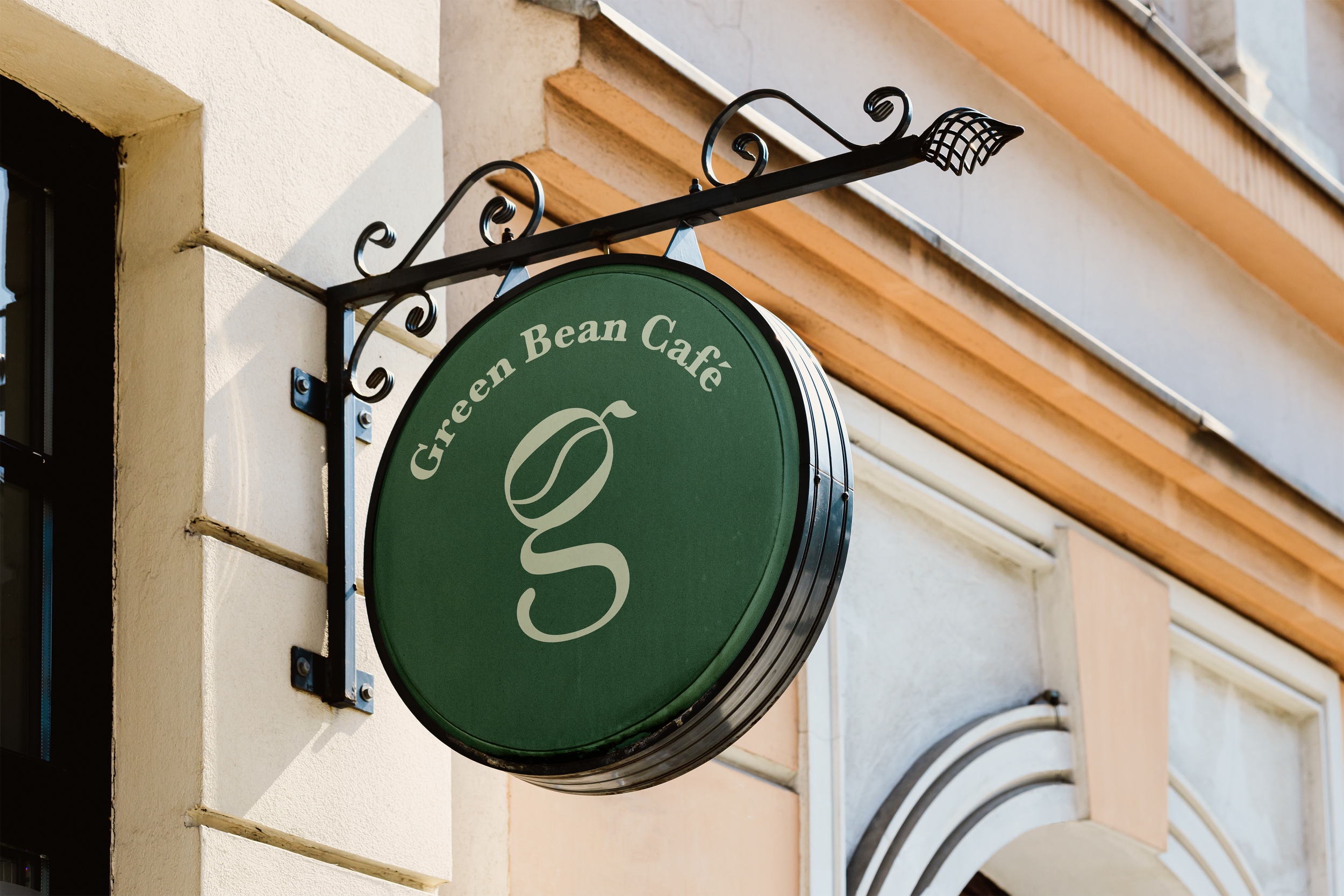
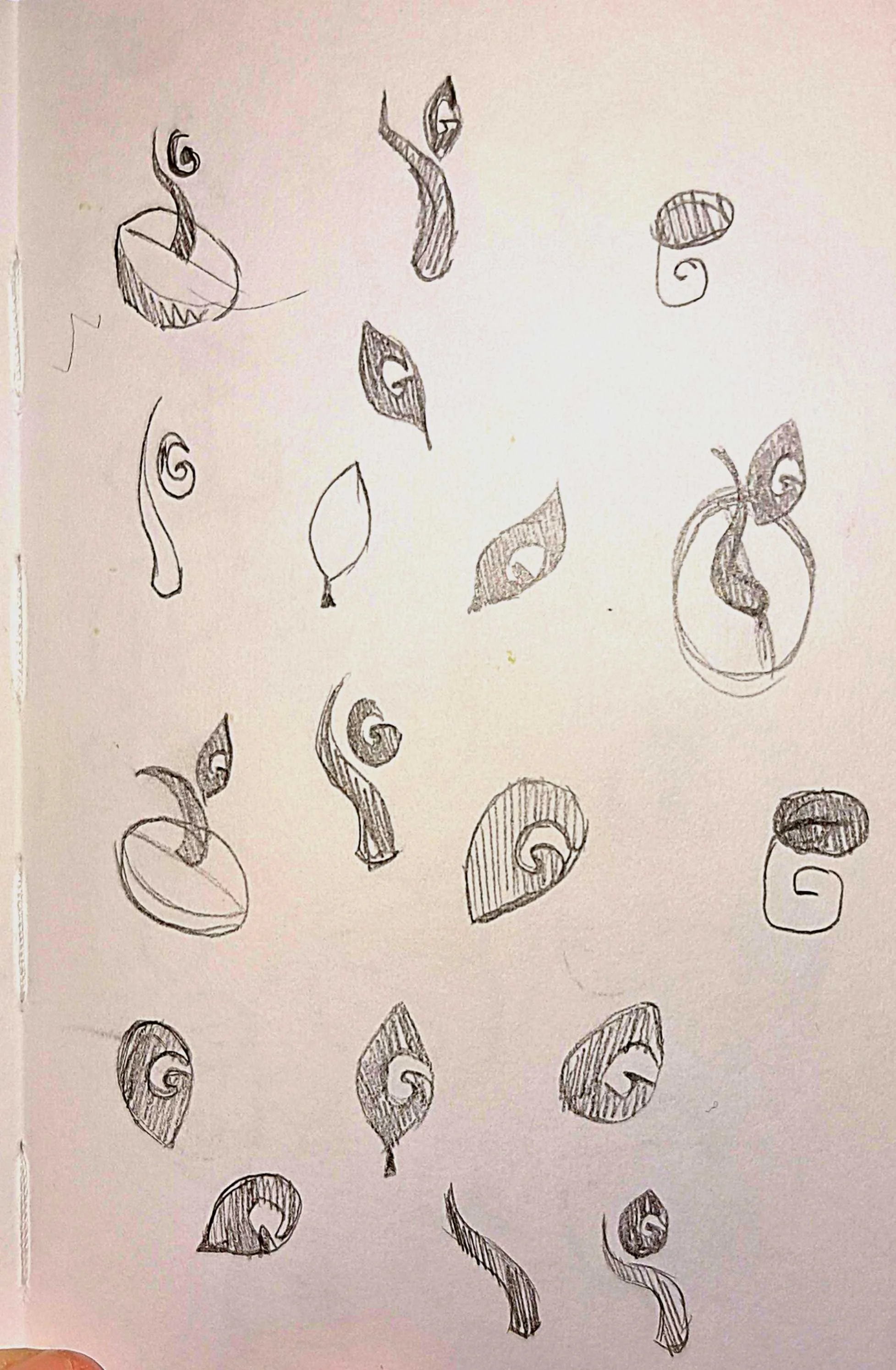
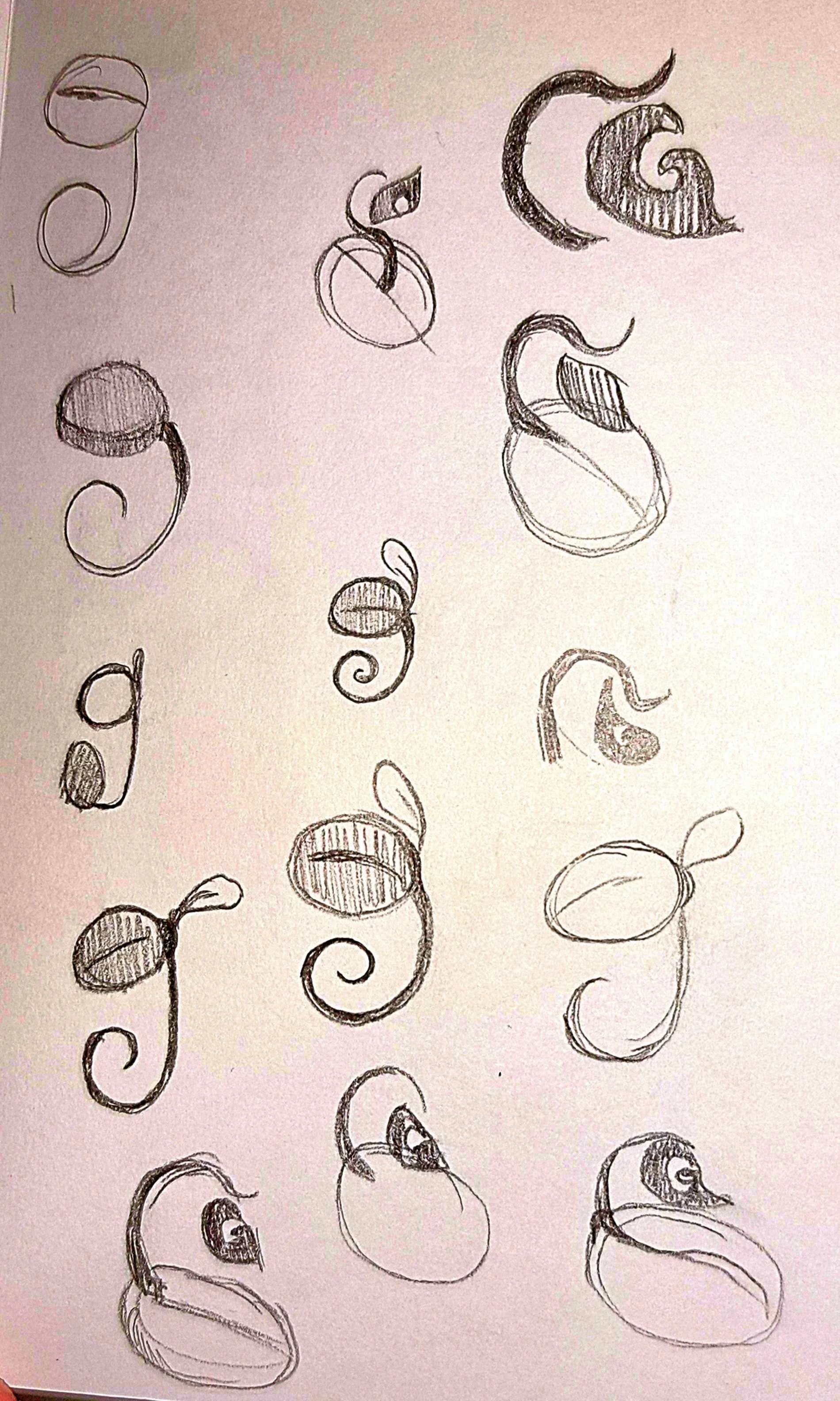
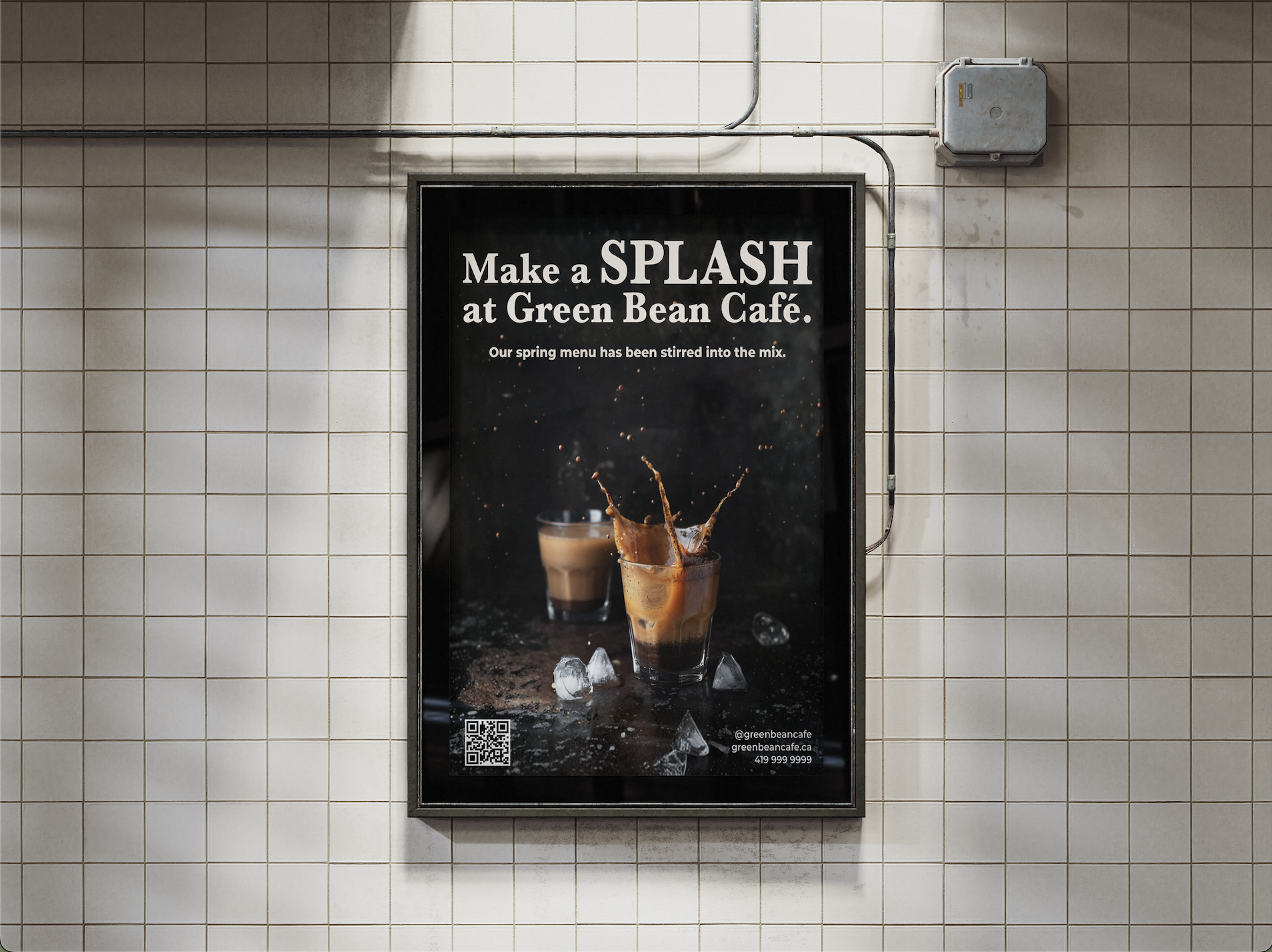
A refined logo was developed with defined proportions, clear space requirements, and minimum sizing standards to ensure reliable application across digital and physical formats. Rather than operating as an isolated graphic, the logo now anchors a cohesive visual framework built to strengthen recognition over time.
A strategic colour system was introduced to balance emotional warmth with functional clarity. Deep greens establish trust and familiarity, while roast-inspired tones add depth and approachability. Each colour was assigned a defined role within the hierarchy to improve contrast, accessibility, and consistency across layouts. Typography pairings and structured spacing systems further reinforced clarity, creating a calm and intentional rhythm across both web and print applications.
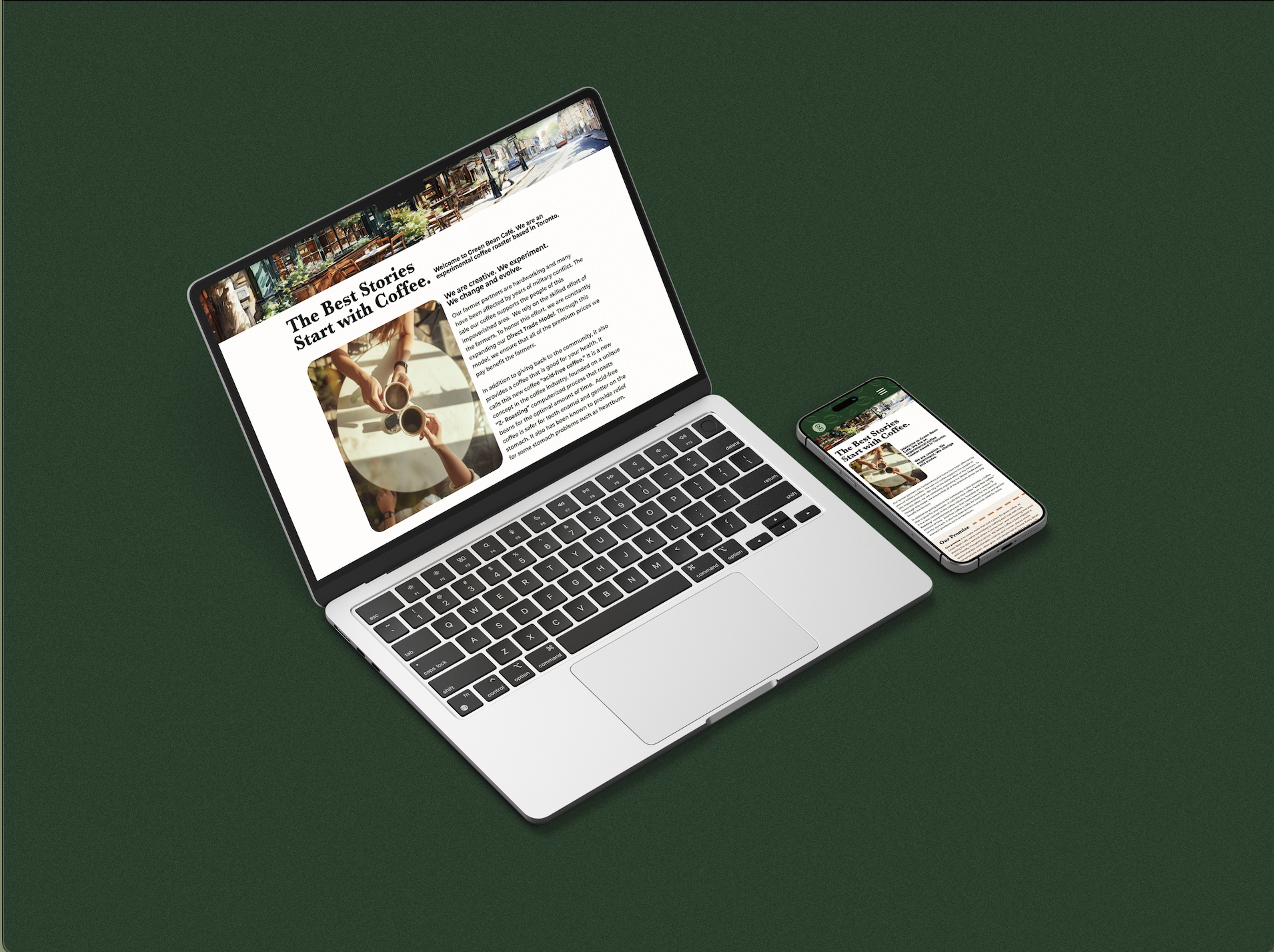
These principles were carried into the website redesign through improved navigation flow, stronger content hierarchy, and consistent visual patterns. The updated digital presence now aligns with the café’s in-store atmosphere, communicating care, craft, and professionalism while improving usability.
As a result, Green Bean Café is positioned for measurable growth. A cohesive identity strengthens brand recall and differentiation within a competitive local market. The improved website structure is projected to increase user engagement by 15–25%, while greater visual consistency across touchpoints may contribute to a 10–20% rise in local recognition and foot traffic over time. Operationally, defined brand guidelines reduce design guesswork and can decrease content production time by 20–30%, supporting more efficient marketing efforts.
The outcome is not simply a visual refresh, but a strategic foundation built to support trust, recognition, and sustainable brand equity.