

This brand identity package was created to give Sara Curto Career Coaching a clear, consistent foundation across every touchpoint. As the business continues to grow across digital platforms, coaching materials, and client-facing content, the guide serves as a central reference for how the brand should look, feel, and show up in the world. It brings together the logo system, colour palette, typography, spacing, and real-world applications into one cohesive framework.
Beyond visual consistency, the booklet helps protect the heart of the brand. It ensures that every asset reflects Sara’s values of personal growth, confidence, and support, while remaining flexible enough to evolve with the business. Whether applied to YouTube content, social media, client resources, or future collaborations, the brand identity guide makes it easier to create work that feels intentional, recognizable, and aligned with the experience Sara provides to her clients.
Sara Curto Career Coaching
Problem
Sara Curto Career Coaching had an established brand presence, but its visual foundation was not built to scale. The existing logo was an image-based design featuring Sara rather than a vectorized mark, which limited its flexibility and made consistent use difficult.
The supporting visual elements presented additional challenges. The original colour palette lacked sufficient contrast, reducing clarity and limiting its effectiveness across digital content. Typography choices were not fully defined or complementary, leading to inconsistencies and a weaker sense of visual cohesion.
As the business continued to grow, these limitations made it harder to maintain a polished, recognizable identity. The brand needed a structured system that could improve clarity, consistency, and professionalism while still preserving the warmth and personal connection central to Sara’s coaching work.
The brand needed a professional, recognizable identity that could support growth while still preserving the personal connection that defines Sara’s coaching approach.
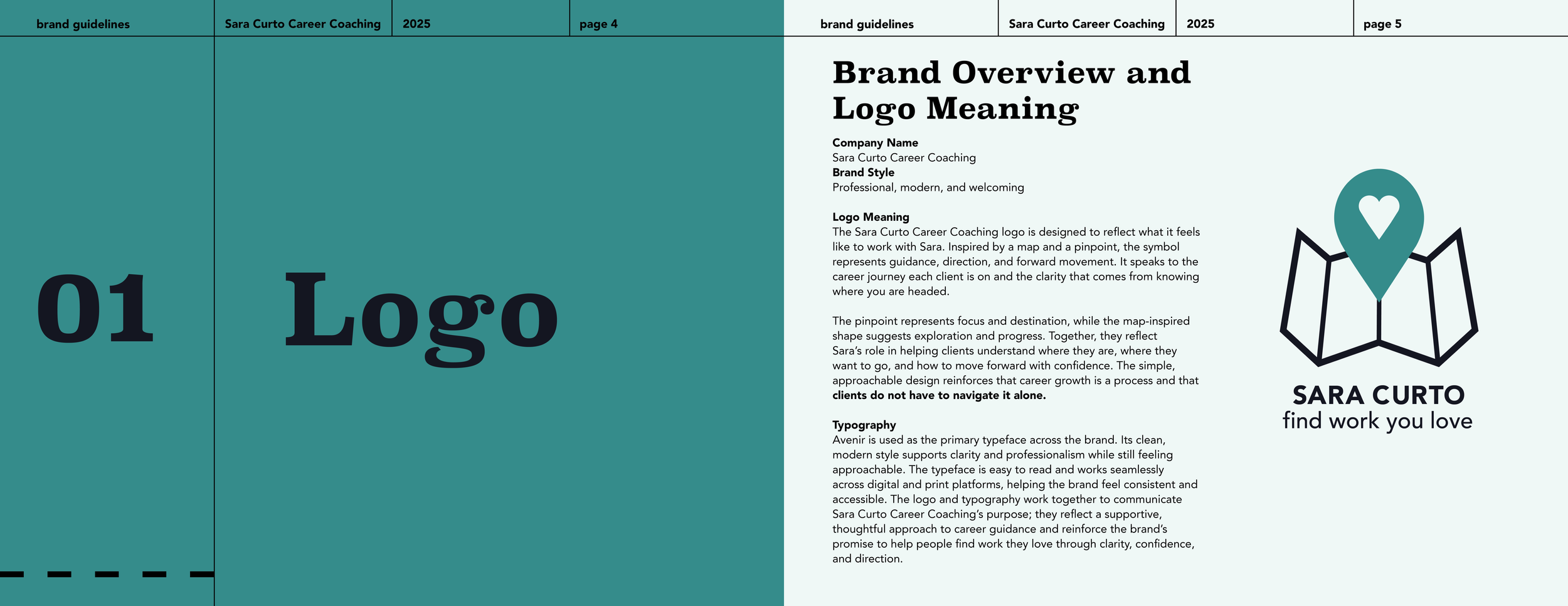
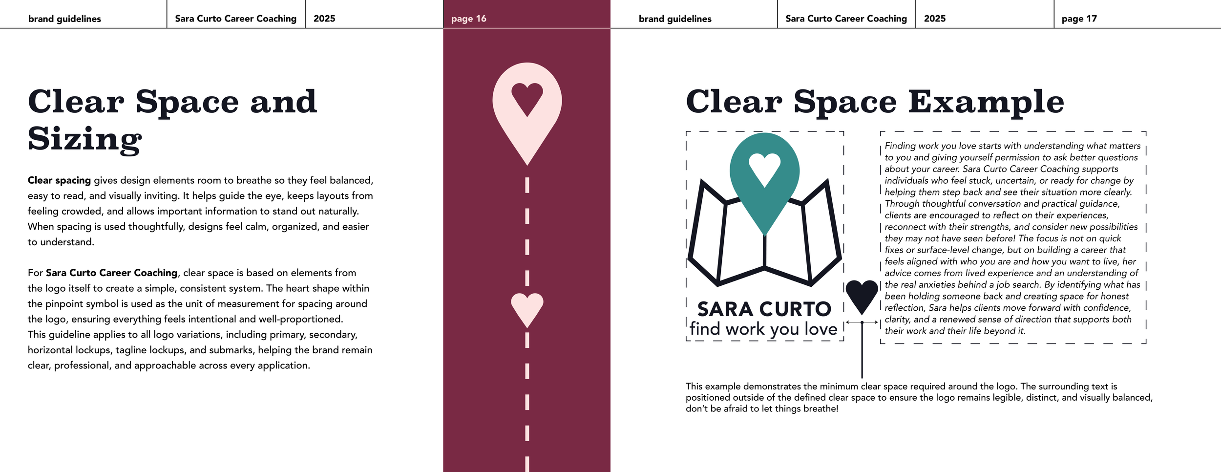
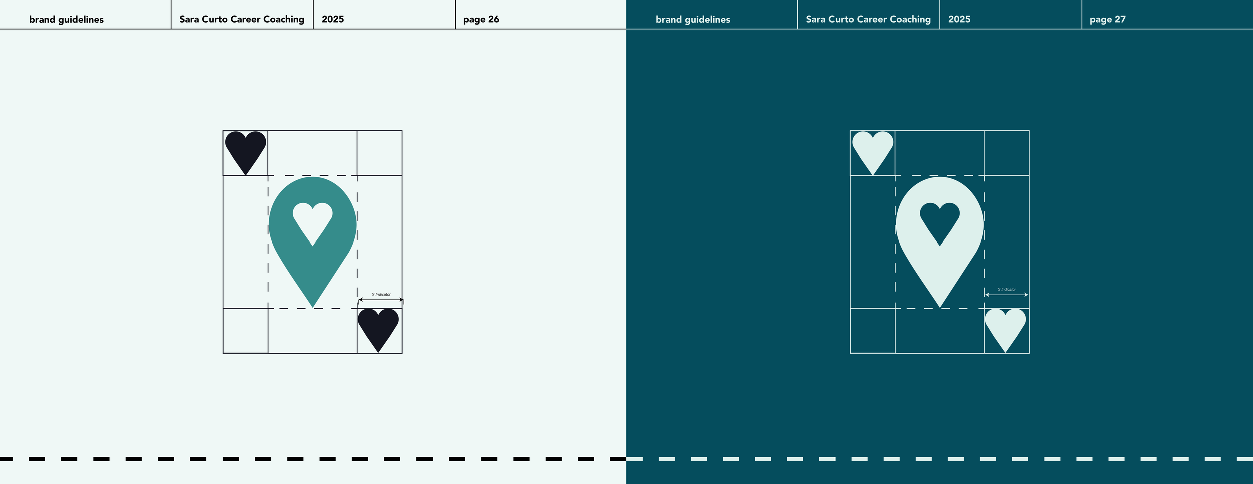
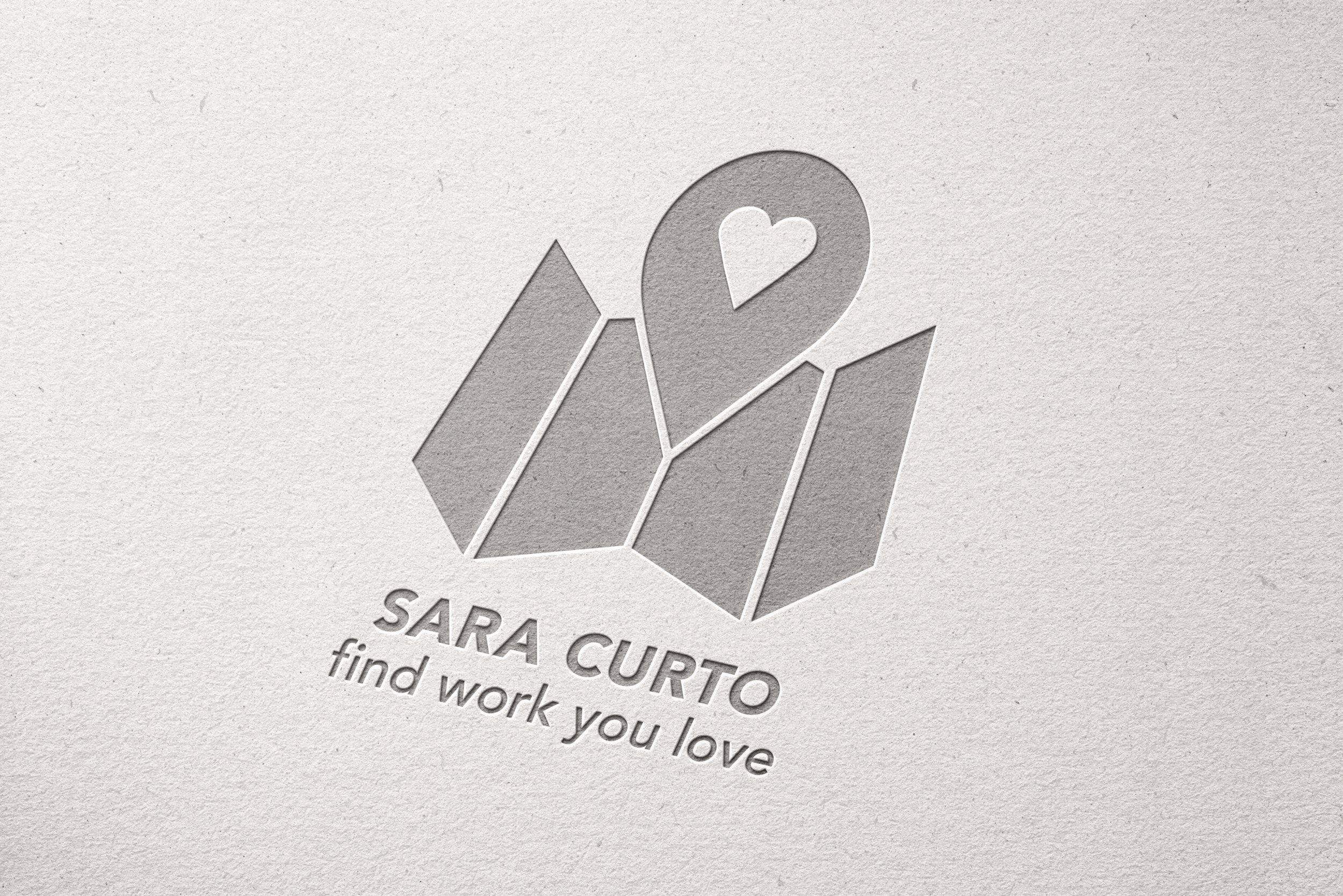
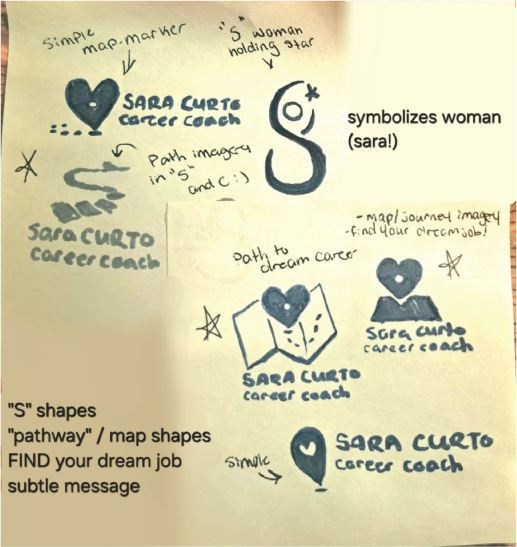
explored a few different options, based off Sara’s career coaching slogan, “Find your Dream Job.” Maps and paths were experimented with, the “S” of Sara was toyed with to symbolize women, Sara’s main demographic.
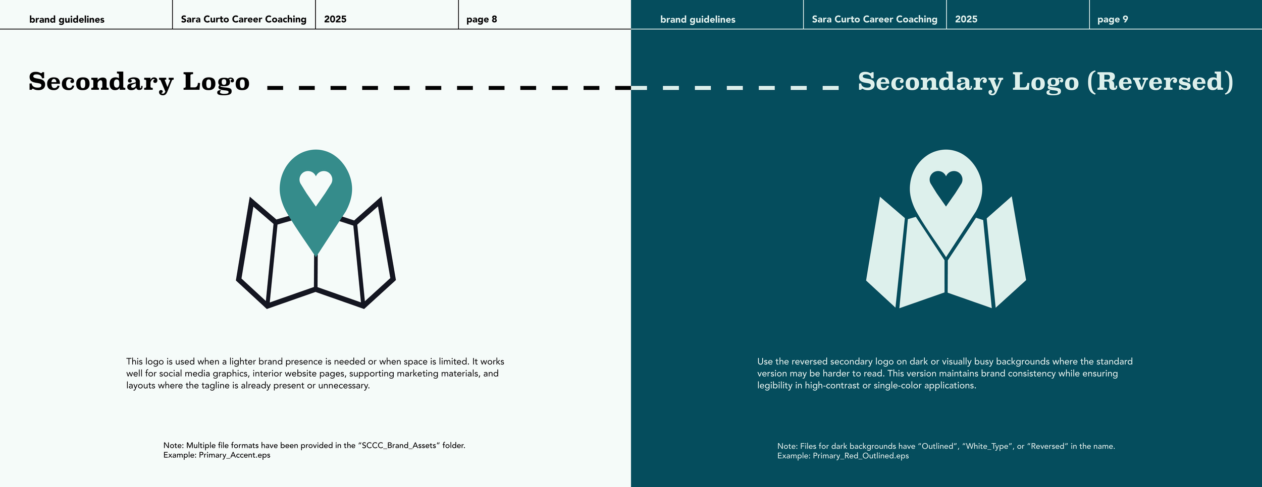
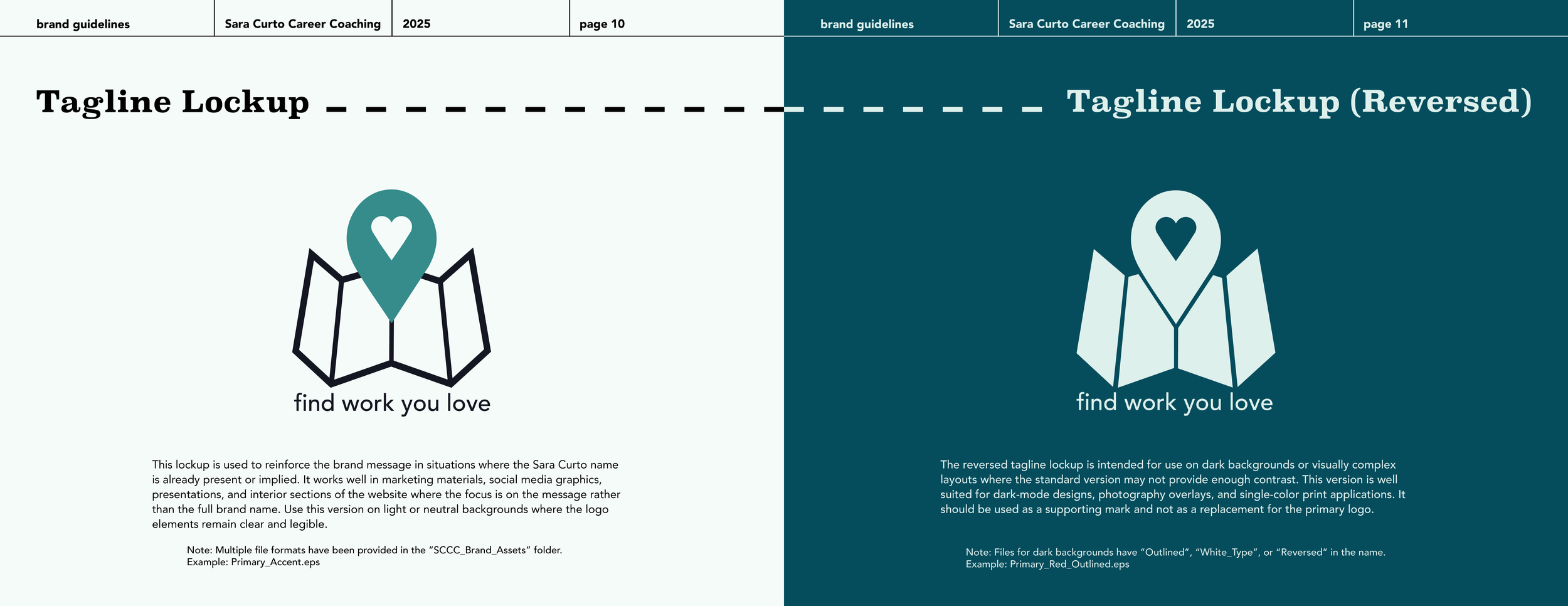
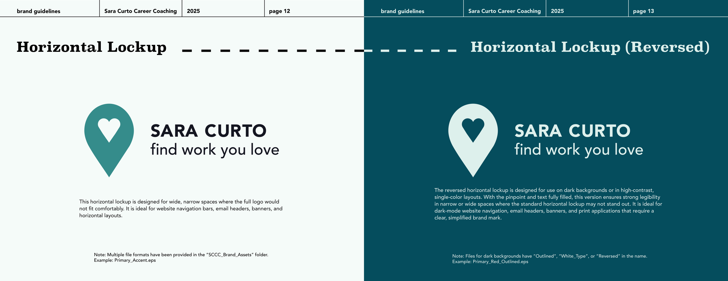
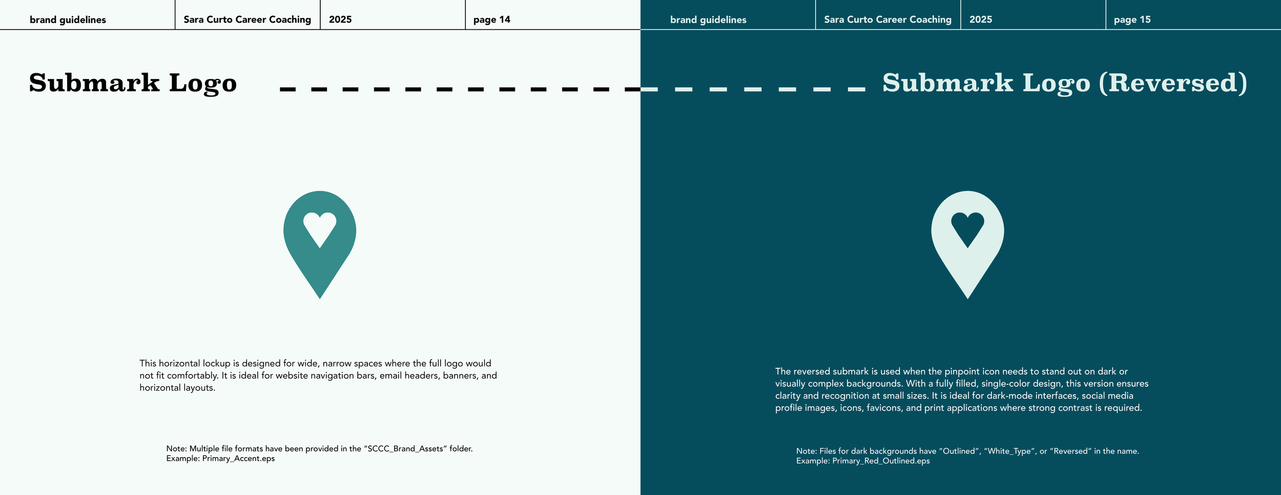
Ultimately, I fell in love with the idea of a simple map pinpoint, something that could be easily recognizable and implemented into her social media and video assets.
Context
Career coaching is a highly personal, trust-driven service, clients are not only investing in professional guidance, but in confidence, reassurance, and long-term growth, they need to feel like their coach is actually invested in their success. In this space, visual consistency plays a critical role in reinforcing credibility and emotional alignment, especially in digital-first environments where first impressions happen quickly.
As Sara’s audience and content output grew, the brand needed a structured yet flexible identity system that could support ongoing content creation without sacrificing cohesion or intention.
Key Insights
Human-Centered Professionalism
Many career coaching brands lean too corporate or too casual, which can feel impersonal or unstructured. Having worked with Sara, I know how integral her warmth and friendliness is to her clients, her work is based off personal experience in jobs she hated, her goal is to help people avoid that trend of waking up every Monday dreading their job. This identity balances professionalism with warmth, allowing the brand to feel credible without losing its human, supportive tone.Visual Confidence Without Intimidation
Job searching and career growth are often vulnerable experiences. The visual system avoids harsh contrasts or overly rigid layouts in favor of calm structure, readable typography, and intentional spacing. This creates a sense of confidence and reassurance rather than pressure, helping clients feel supported instead of overwhelmed.Visual Confidence Without Intimidation
Job searching and career growth are often vulnerable experiences. The new visual system avoids harsh contrasts or overly rigid layouts in favor of calm structure, readable typography, and intentional spacing. This creates a sense of confidence and reassurance rather than pressure, helping clients feel supported instead of overwhelmed.
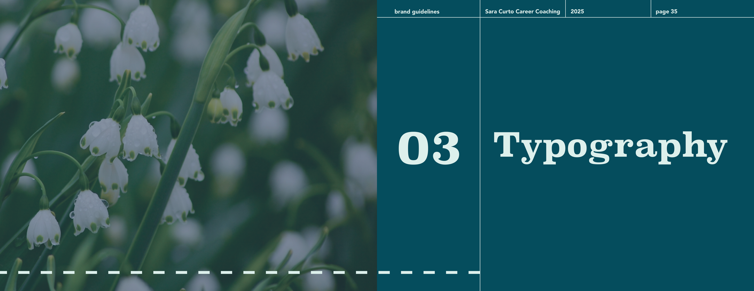
Solution
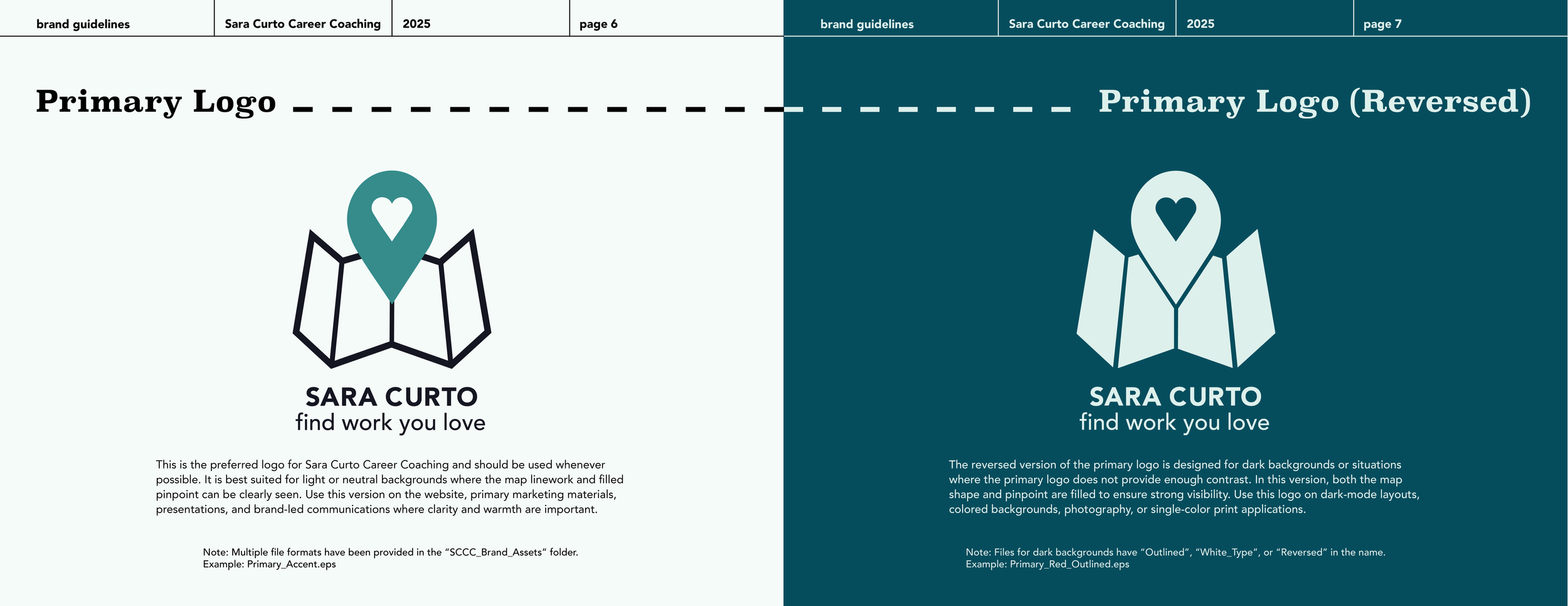
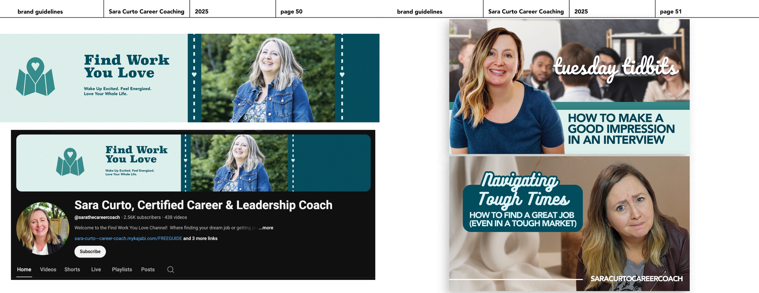
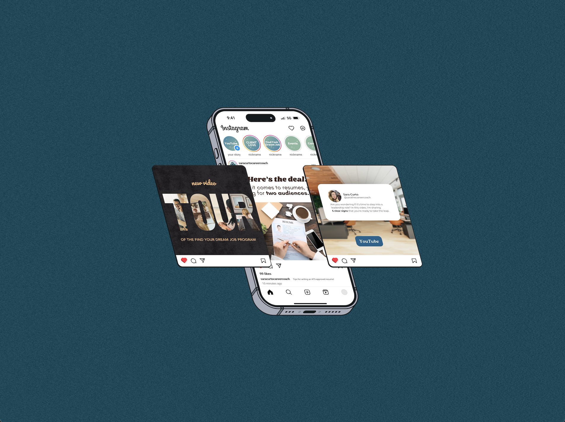
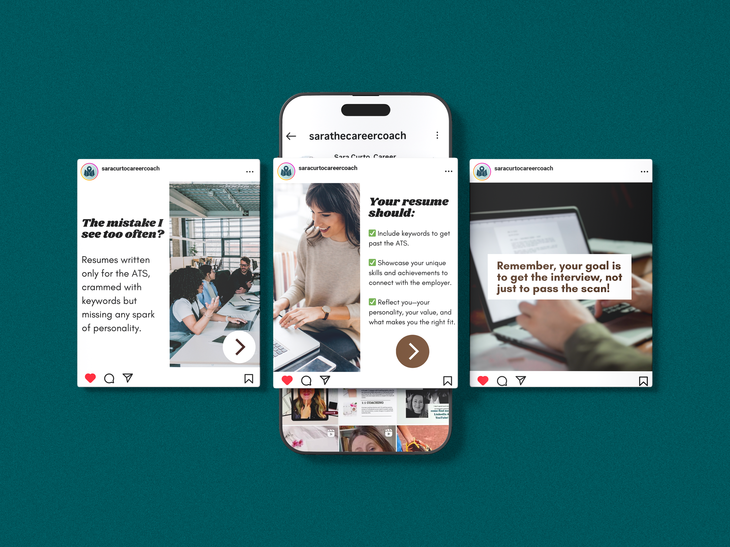
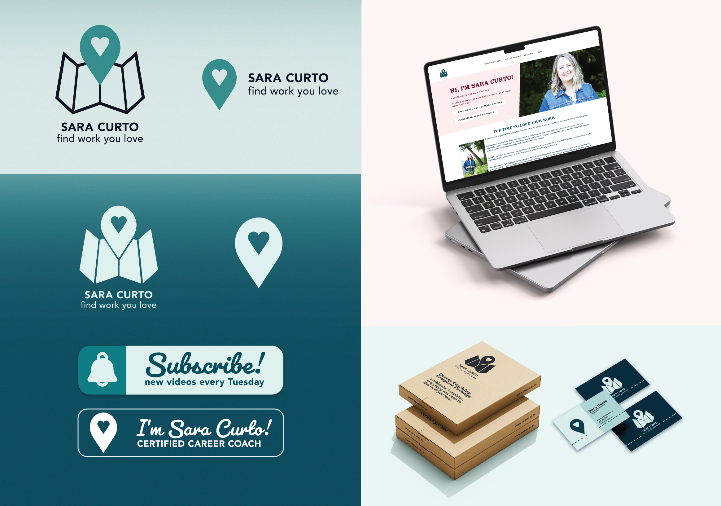
The visual identity was designed to reflect Sara’s warmth and lived experience while maintaining the credibility expected of a career coach. Rounded corners soften layouts and reduce rigid structure, creating a welcoming, human feel, while dashed lines introduce a subtle map motif that reinforces guidance, direction, and progress throughout the brand.
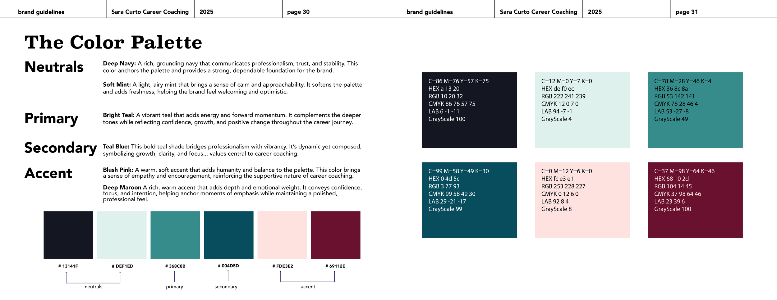
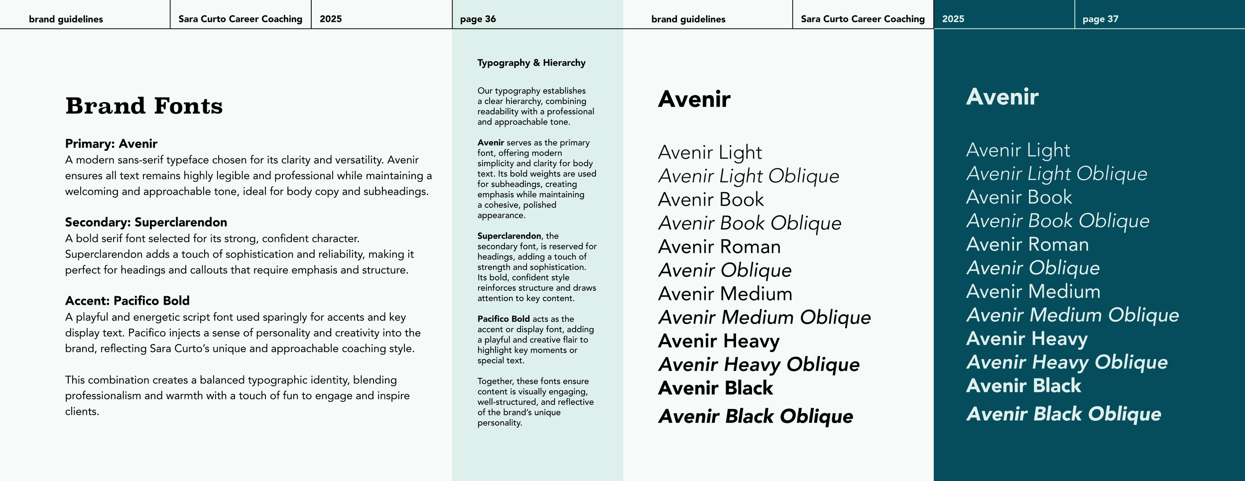
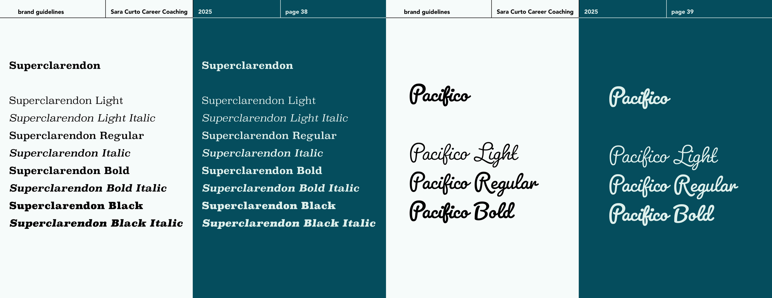
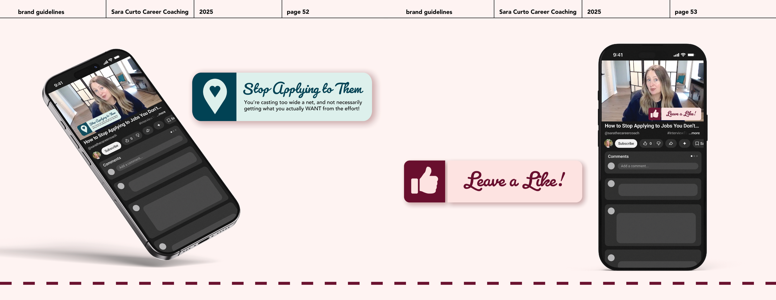
Blues and teals form the core of the colour palette, communicating trust, calm, and clarity. Balanced contrast ensures strong readability without visual harshness, helping content feel reassuring during an often overwhelming career journey. Typography reinforces this balance, with Superclarendon adding confidence and structure, Avenir supporting clean, modern readability, and Pacifico Bold used sparingly to reflect Sara’s encouraging voice and personality.
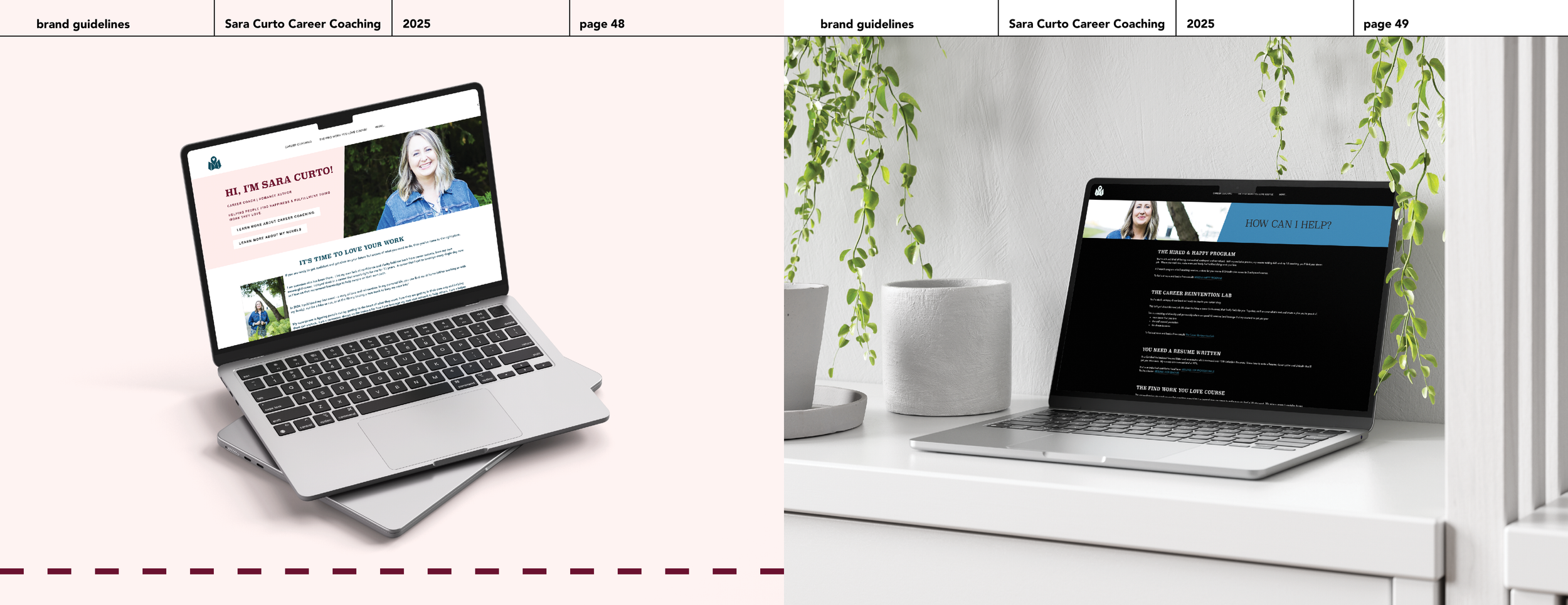
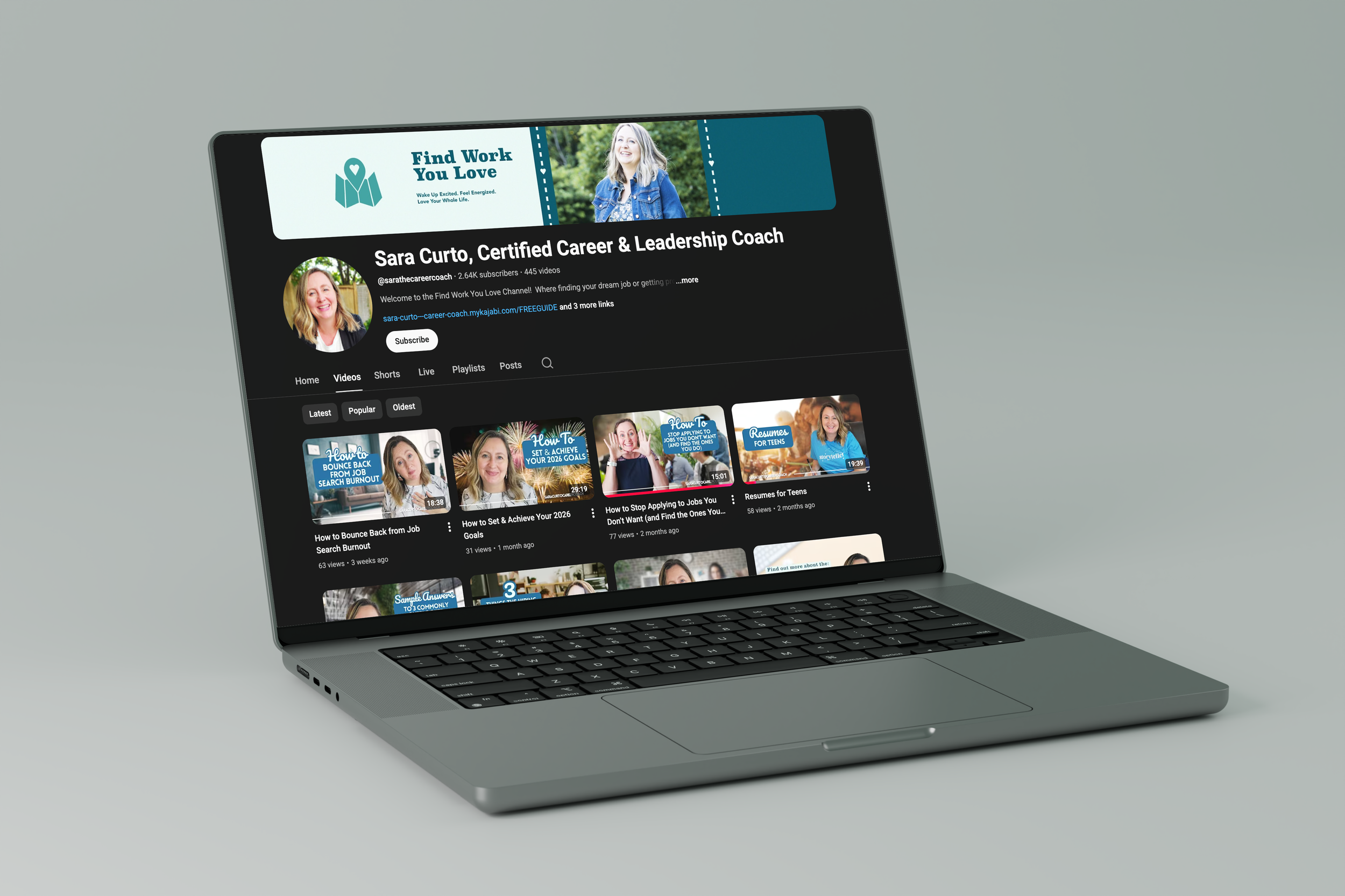
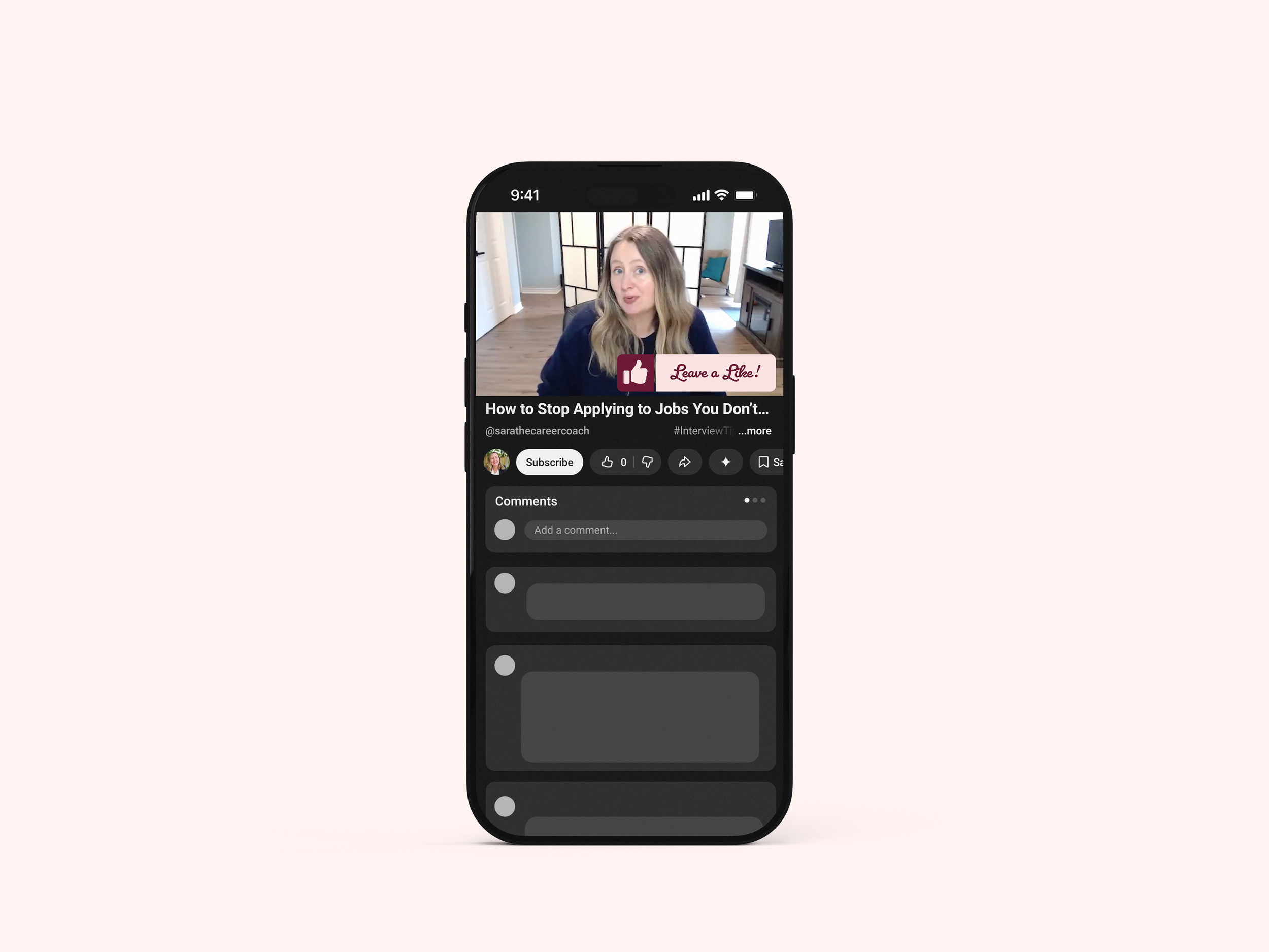
Alongside the refreshed brand system, video assets and content structure were redesigned, including a transition to Premiere Pro for more polished, consistent editing. These updates improved visual cohesion and recognition across platforms. Following the rollout, Sara Curto Career Coaching experienced a 400 percent increase in YouTube subscribers, highlighting how thoughtful branding and intentional design choices can directly support growth, trust, and audience engagement.