

Sunroast Coffee
Role: Brand Identity & Visual Designer
Deliverables: Logo, Brand System, Packaging, Marketing Assets
Tools: Illustrator, Photoshop, InDesign
Project Overview
Sunroast Coffee is a conceptual branding project focused on developing a sustainable, rustic, and welcoming identity for a fictional specialty coffee company. The goal was to create a brand that balances modern design sensibilities with a warm, homey charm, appealing to eco-conscious consumers while remaining approachable and authentic.
The project explored how thoughtful visual systems can communicate values beyond aesthetics. Through logo design, colour, typography, and supporting patterns, the identity emphasizes sustainability, craftsmanship, and comfort, key attributes in the specialty coffee space. This project strengthened my understanding of cohesive storytelling in branding, demonstrating how a well-structured visual identity can resonate with a specific audience while supporting a company’s mission and positioning. Sunroast Coffee reflects my approach to design as both a creative and strategic tool.

Problem
Sunroast Coffee lacked a distinct brand identity in an increasingly saturated specialty coffee market. Without a clear visual system or positioning, the brand risked blending in with competitors, reducing memorability, customer trust, and long-term brand loyalty, especially among eco-conscious consumers.
Context
Specialty coffee buyers are highly values-driven. Sustainability, authenticity, and warmth heavily influence purchasing decisions, yet many brands rely on generic “eco” visuals that fail to communicate credibility or emotional connection. Sustainability alone is no longer enough; brands must communicate care, craft, and credibility at first glance.
To compete, Sunroast needed a brand that felt:
Trustworthy and environmentally responsible
Approachable and community-oriented
Distinct enough to stand out on shelves and digital platforms.

Key Insights
Sustainability Must Feel Earned
Consumers are skeptical of surface-level “green” branding. Visuals need to communicate care, craft, and longevity, not trends. Brands with clear, metaphor-driven logos are more memorable and easier to associate with values and story.Warmth Builds Trust
Rustic textures, organic forms, and a grounded colour palette increase perceived authenticity and comfort, key drivers for repeat purchases. Earthy, warm tones increase perceptions of approachability and trust, key for products tied to daily rituals like coffee! I made the choice to remind the audience of the various flora associated with the coffee bean to tie it into its roots, literally!Consistency Signals Professionalism
A cohesive identity across packaging and marketing materials improves brand recognition and perceived value. Supporting visuals help brands feel considered and scalable, not one-off.
Solution
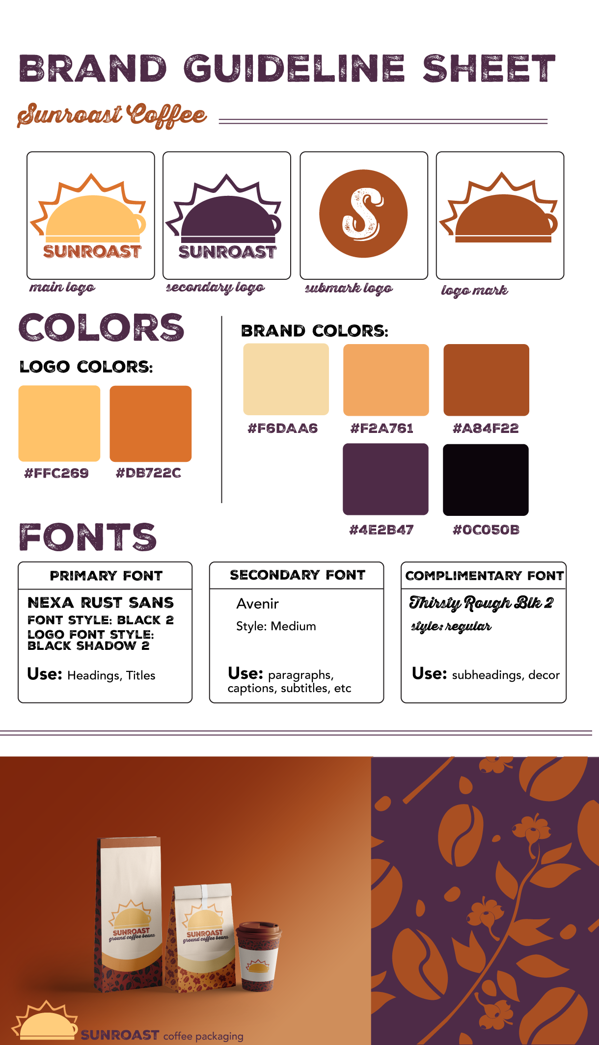
The solution focused on creating a unified visual system that could be applied consistently across all brand assets, ensuring Sunroast Coffee would be instantly recognizable and visually coherent wherever it appears. Rather than designing isolated assets, the brand was built as a flexible system, one that supports clarity, repetition, and long-term use.
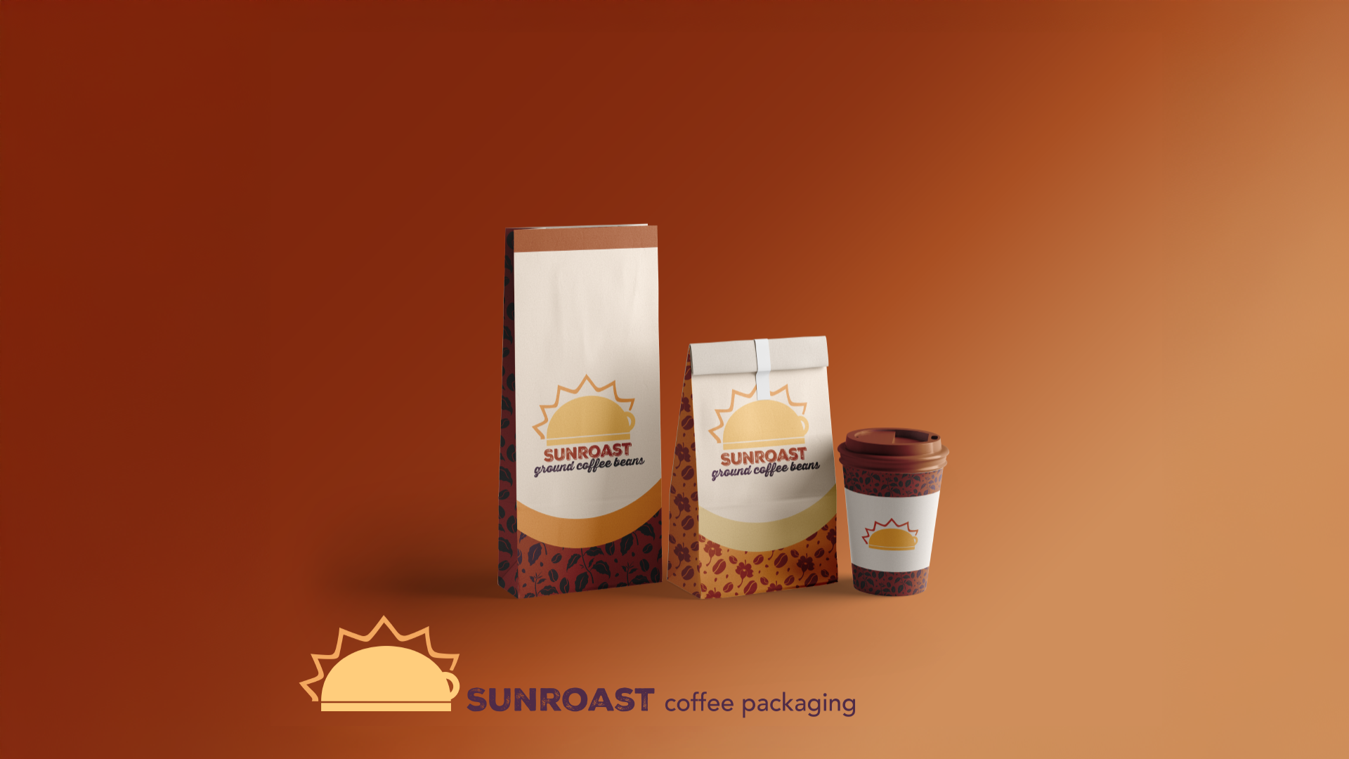
At the center of the identity is the Sunroast logo, designed as an upside-down coffee cup with sun rays emerging from its form. This visual transformation turns a familiar object into a meaningful symbol, reinforcing the brand name while referencing warmth, ritual, and renewal. The simplicity of the mark allows it to scale easily across packaging, print, and digital applications without losing impact.
The color system was intentionally developed to support consistency and recognition. Warm yellows and sienna browns reference sunlight, roasted coffee, and natural materials, while deep purple accents introduce contrast to maintain visual interest. Used together, these colors create a recognizable palette that feels inviting while remaining structured and repeatable across materials.
Accessibility was considered in this palette as well, ensuring the darker browns and purples are highly legible against the lighter yellow backgrounds. The palette can be transferred over onto web and app design, avoiding eye strain or low-contrast combinations within the palette so viewers have as much ease of access as possible.
To extend the identity beyond the logo, a supporting pattern system inspired by coffee beans and coffee flowers was created. These organic elements add depth without overwhelming the brand, allowing Sunroast to maintain visual consistency while adapting to different formats such as packaging, marketing assets, and promotional materials.
By establishing a clear visual system with defined elements and usage, the brand prioritizes consistency helping Sunroast build recognition, communicate professionalism, and foster trust over time. Each component works together to create a reliable, cohesive experience that strengthens the brand with every interaction.
Reflection & Next Steps
This project reinforced the importance of designing systems rather than individual assets. Building Sunroast Coffee as a cohesive brand highlighted how consistency, symbolism, and intentional structure contribute to recognition, trust, and long-term usability.
It also strengthened my understanding of how visual decisions can support brand positioning beyond aesthetics alone.
If expanded further, this case study could include a full website and mobile app experience to explore how the brand system performs across more complex digital touch points.
Extending the identity into UI components, interactive patterns, and real-world use cases would allow for deeper testing of scalability, accessibility, and user flow further strengthening the brand’s presence across platforms.
Sunroast Coffee reflects a shift in my approach to design, I went from purely designing something I thought looked good, to designing something that worked on many levels.
Having a brand identity be flexible and adaptable to the ever-changing world around us while still being iconic and unique in its own right is something I’ll continue to evolve and grow on.